Modual 2
Project 1 - Photoshop
Brief -
We want you to create, in photoshop, a gig poster for a band you have been provided. The musical genre, venue, visual content, size, shape, styling, and all other details are yours to play with; just make sure the name is legible. Your poster will be 100% digital. It wont be printed, it will never exist! But we want you to convince us that it does! We want it to look printed, low fi, textural, beat up, and used. We want you to convince us that it's the real - stolen from a gig, hold it in your hand, stick it on the wall - deal.
Outcome -
Gig poster (creatively presented)
Any additional band paraphernalia you create - badges, t-shirts, etc
Research and development
We want you to create, in photoshop, a gig poster for a band you have been provided. The musical genre, venue, visual content, size, shape, styling, and all other details are yours to play with; just make sure the name is legible. Your poster will be 100% digital. It wont be printed, it will never exist! But we want you to convince us that it does! We want it to look printed, low fi, textural, beat up, and used. We want you to convince us that it's the real - stolen from a gig, hold it in your hand, stick it on the wall - deal.
Outcome -
Gig poster (creatively presented)
Any additional band paraphernalia you create - badges, t-shirts, etc
Research and development
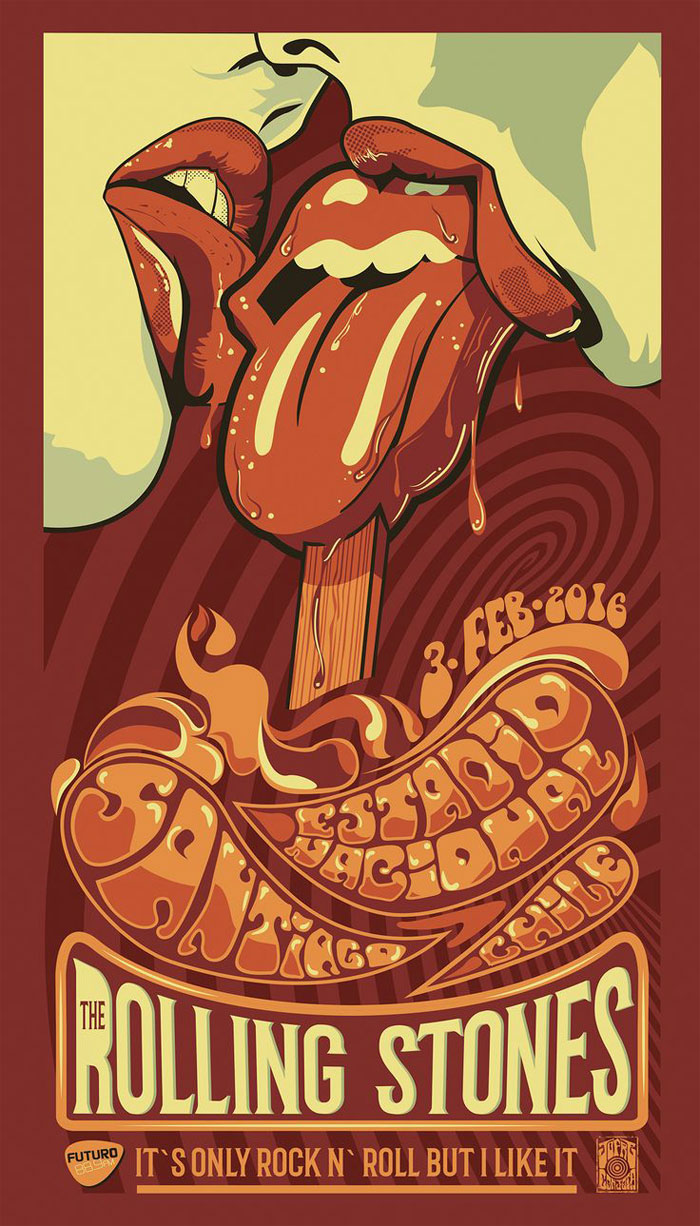
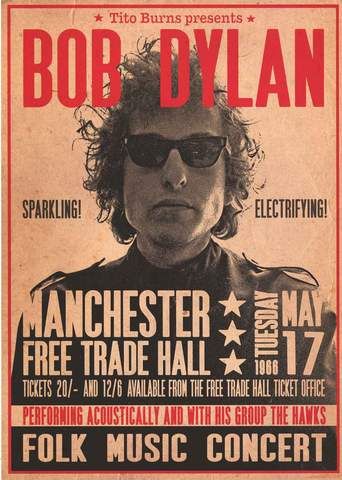
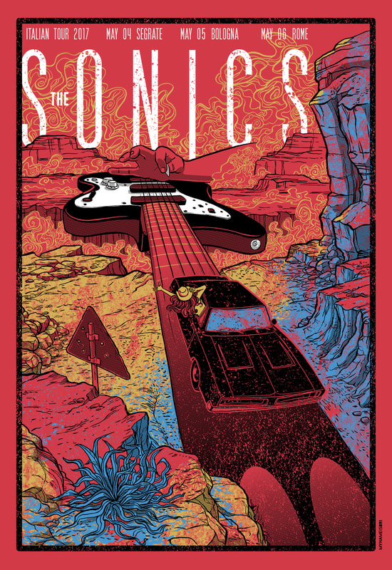
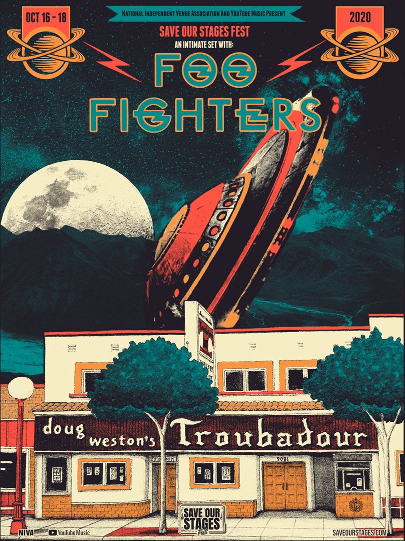
Existing band posters
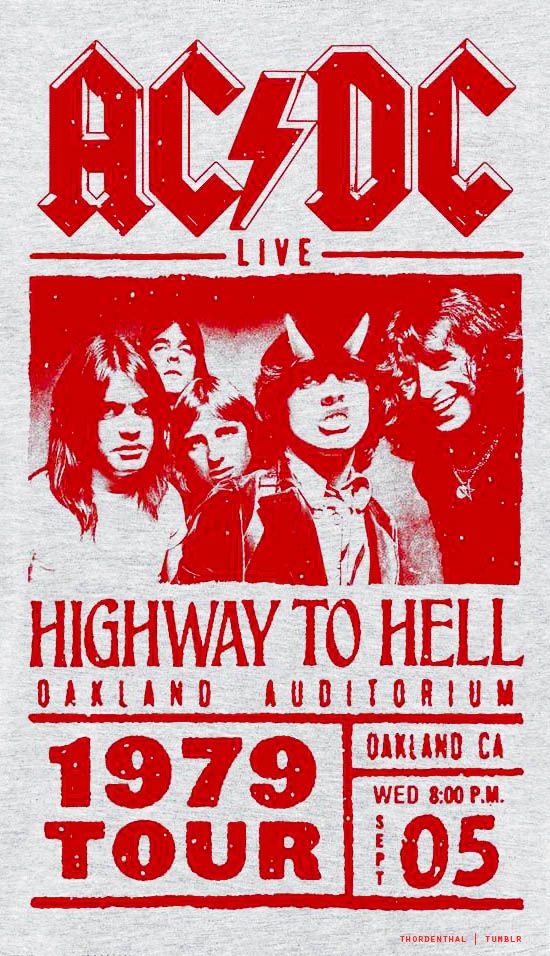
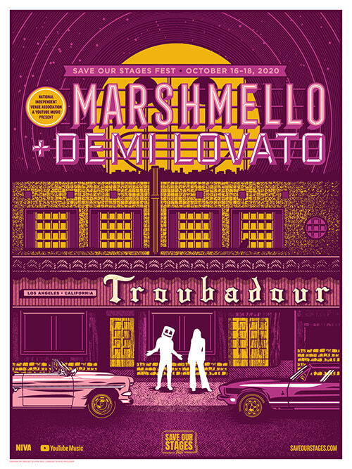
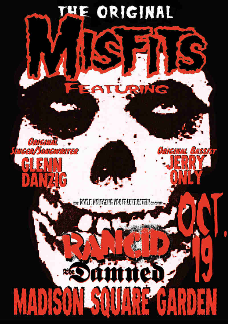
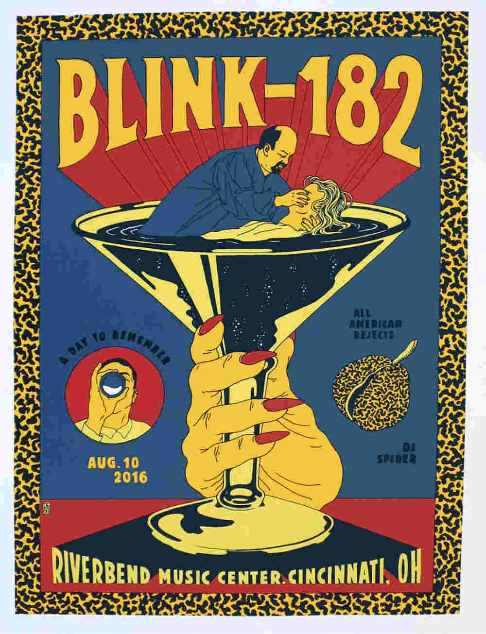
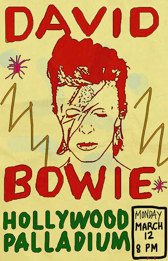
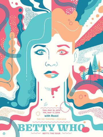
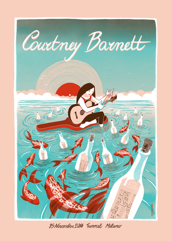
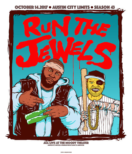
Artist research
|
|
|
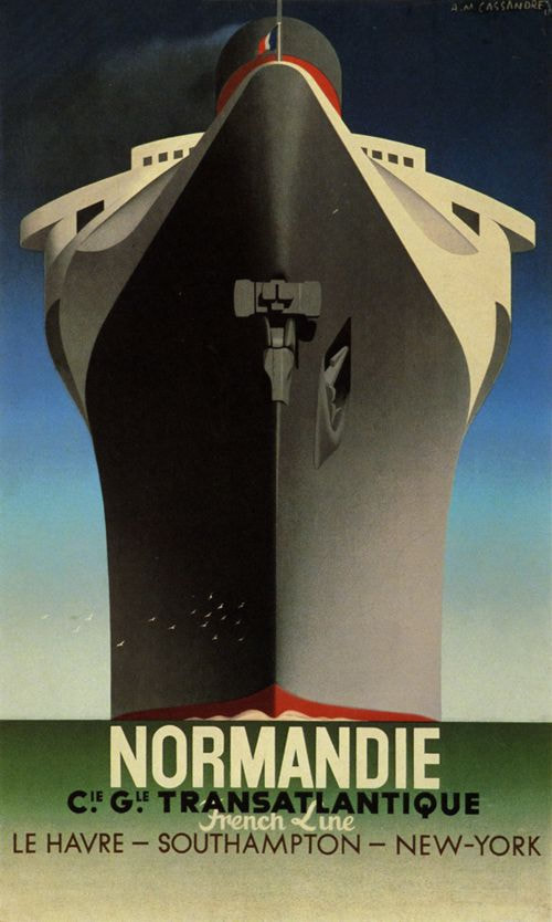
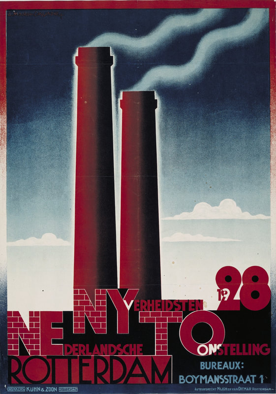
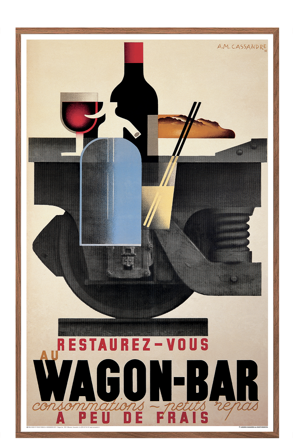
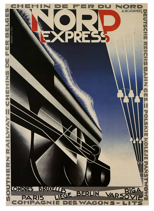
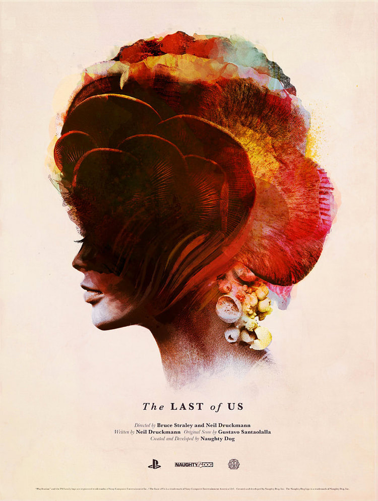
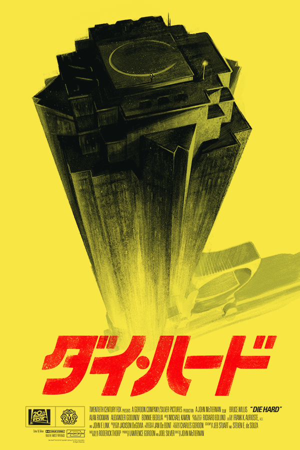
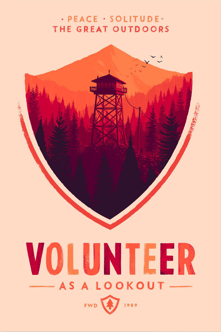
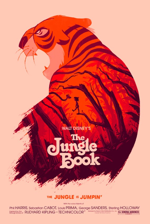
Olly MossOlly Moss is an English graphic artist, who is best known for his reimagining of movie posters. A graduate of the University of Birmingham, he has been hired to produce work for multiple notable companies, including Marvel, Valve, Pottermore, and Empire Magazine.
Co-founder of the gaming company Campo Santo, he was the art director for the video game Firewatch, inspired by the iconic 1960's National Park posters. Now working for the gaming company Valve, he has worked as an artist on Half-Life: Alyx, and has illustrated the August 23rd 2017 issue of the Rick and Morty comic series. I love his creative use of illustration and silhouettes in his posters, as well as his gorgeous understanding of colour and texture in his work. I will try to incorporate his through understanding of composition and layout into my work. |
|
|
|
|
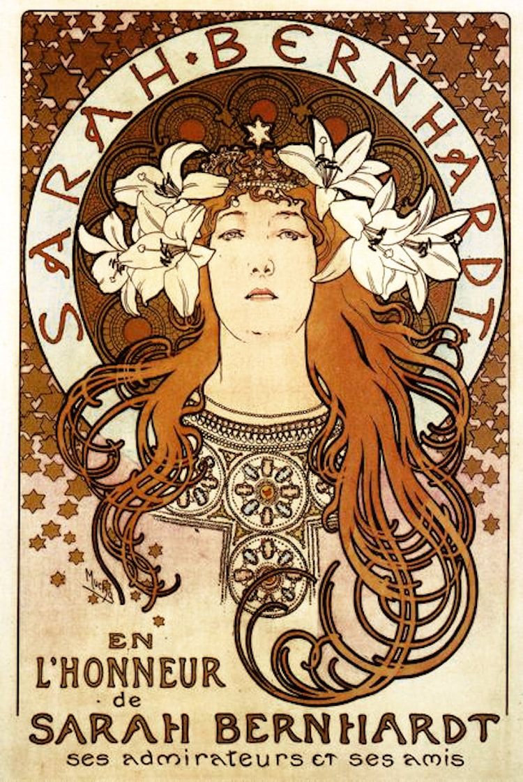
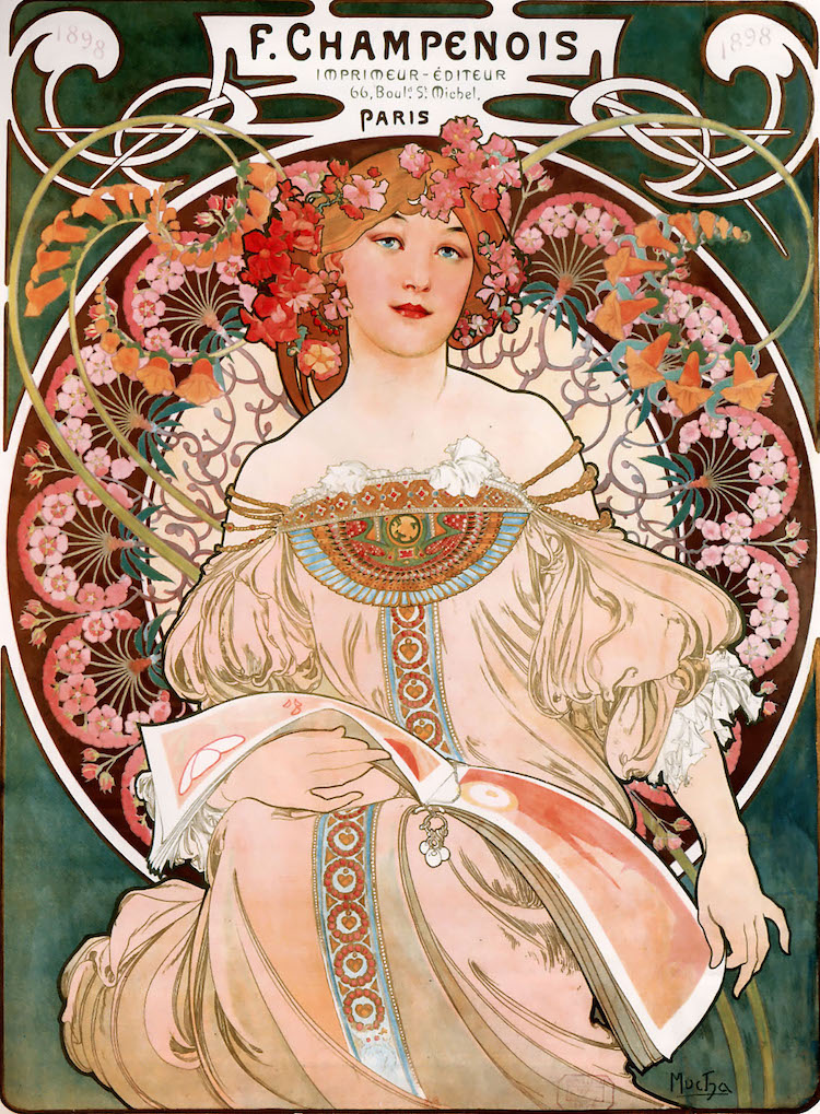
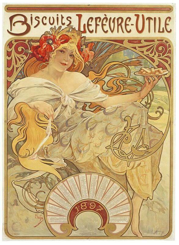
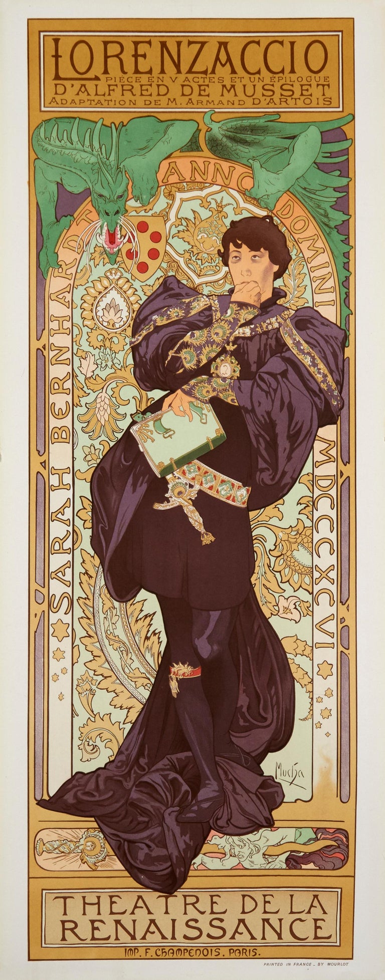
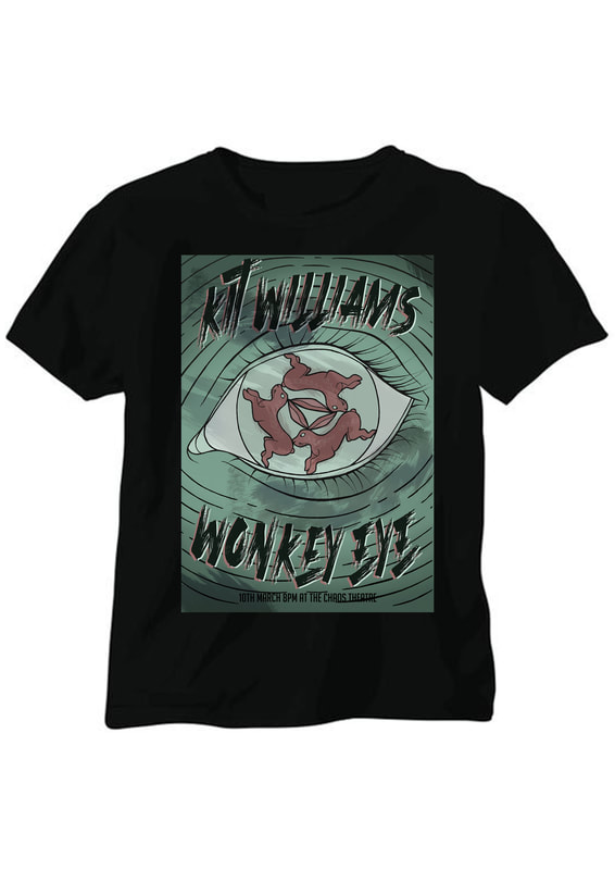
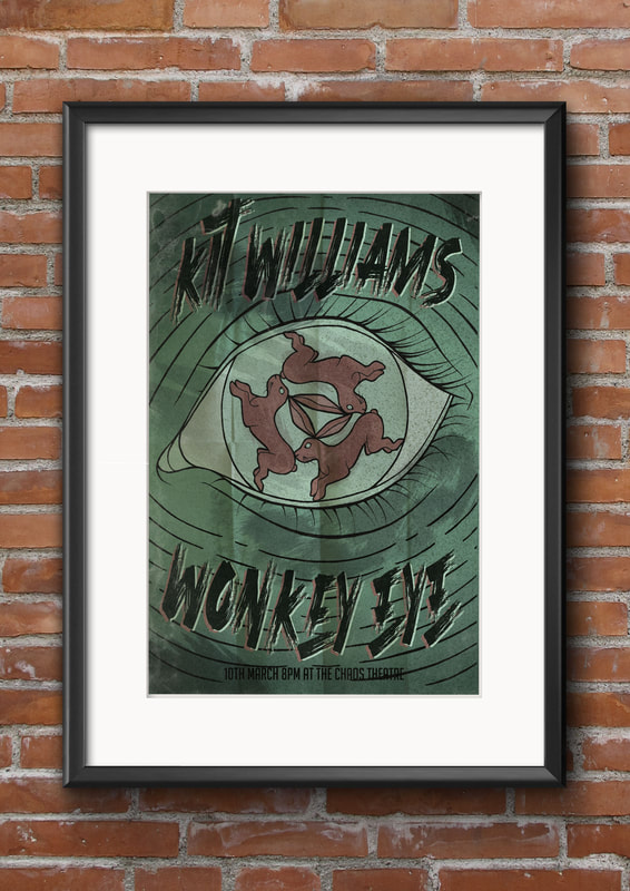
The band name I was given was "Kit WIlliams' Wonkey Eye". After some thought an research, I decided to have my poster advertise for a folk rock band.
|
|
Kit WilliamsKit Williams is an English artist, illustrator and author who is best known for his book, Masquerade, which is a storybook filled with illustrated clues to the location of a golden hare buried somewhere in Britain.
|
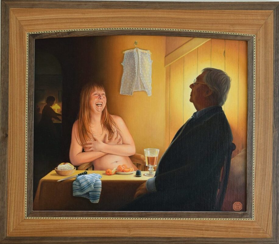
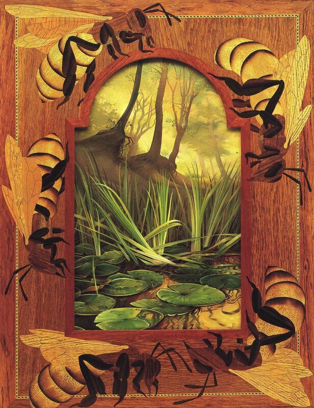
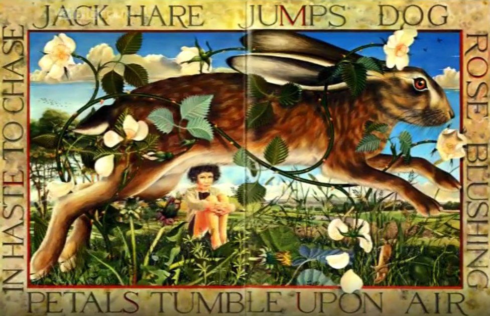
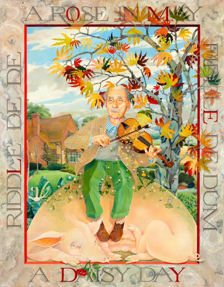
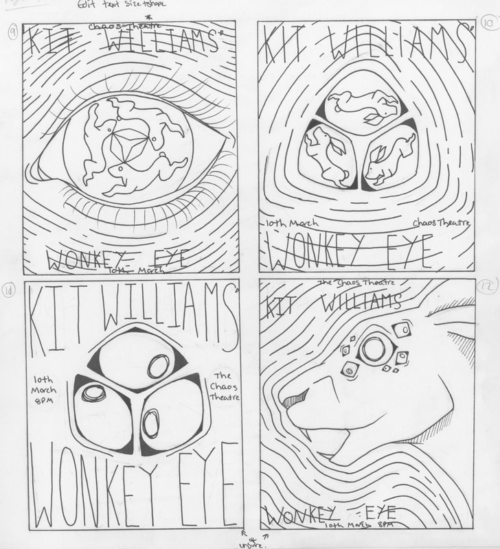
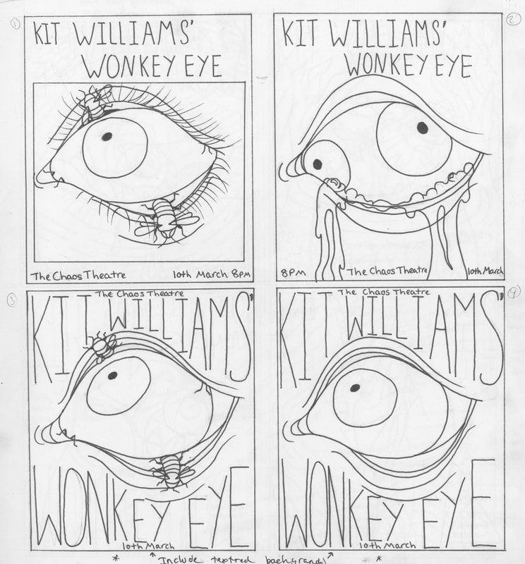
Initially, I sketched out 15 rough thumbnails playing with the themes of the band name and my research. At the beginning I mostly focused on the hare imagery in my work, but then also moved onto including eyes and bees due to the name of the band, and influence by Kit Williams' untitled "Bee Book".
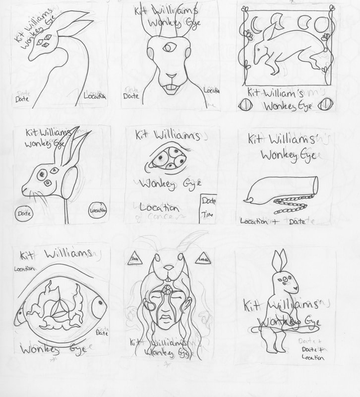
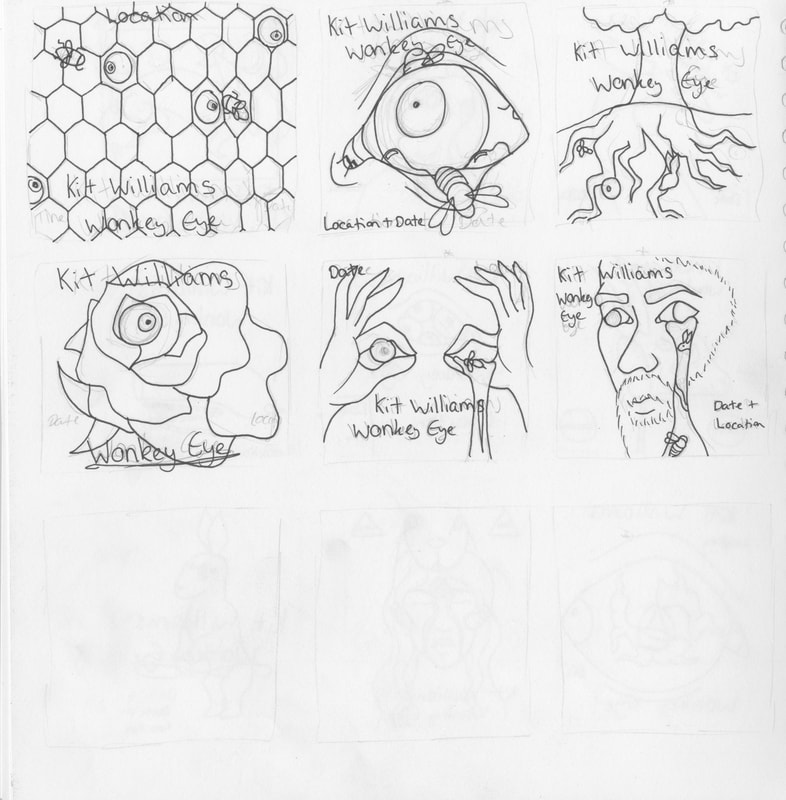
Afterwards, I chose my favourite seven, and refined them even more from the thumbnails.
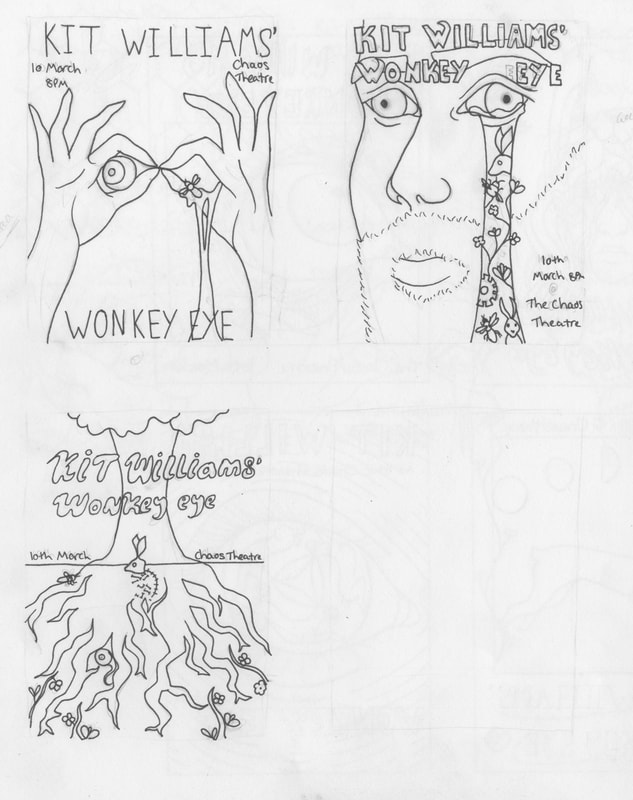

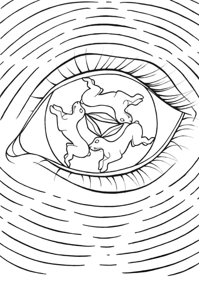
Then, I picked my favourite four, and toyed with their designs slightly to find my favourite. I chose the initial rabbit eye design.
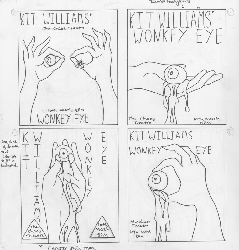
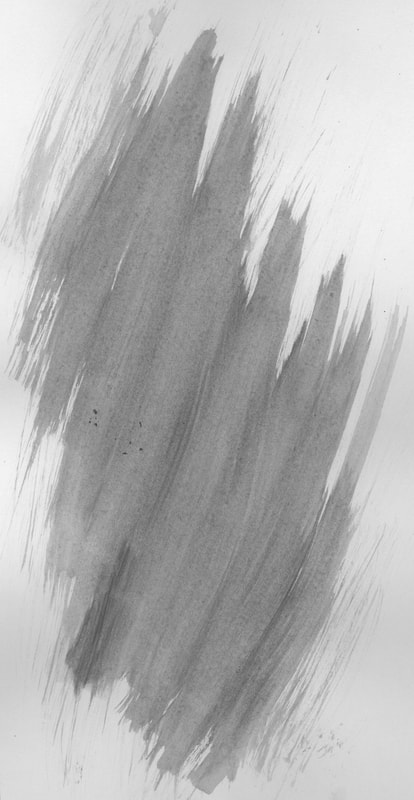
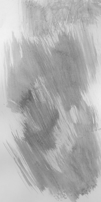
Afterwards, I painted some textures into my sketchbook to scan into my piece to give them more life.
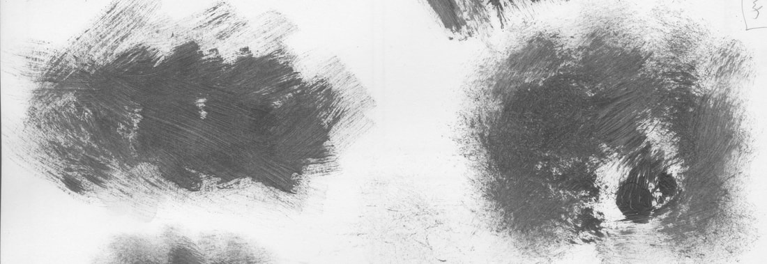
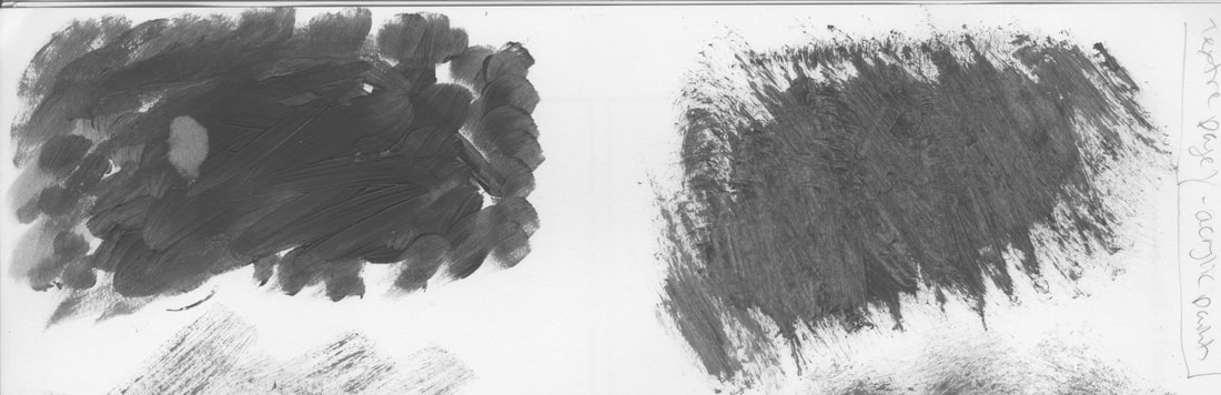
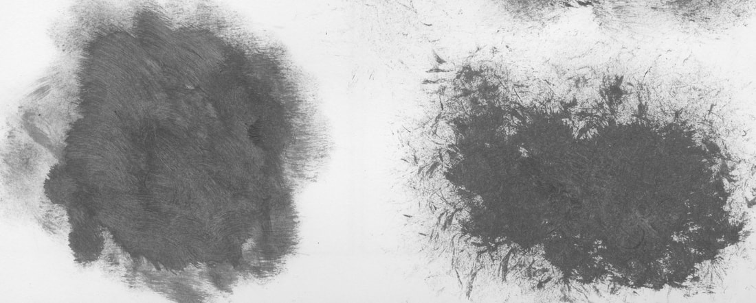
|
After some deliberation, I chose this design as my favourite, and scanned it into photoshop so I could start playing around with potential colour schemes. I drew the original illustration in my sketchbook, but I messed up the bottom section of the line so I redrew them again on another page. When I scanned them in, I placed them together in photoshop to bring the whole piece together again. I only drew one hare on the sketch, but I then duplicated them and moved them into the trio. However, due to the shape of the eye the hares don't all fit in equally, and this then makes the triangle of ears uneven and wonky in the centre. |
|
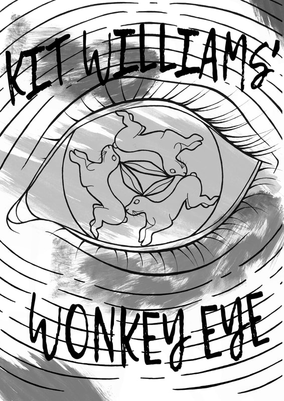
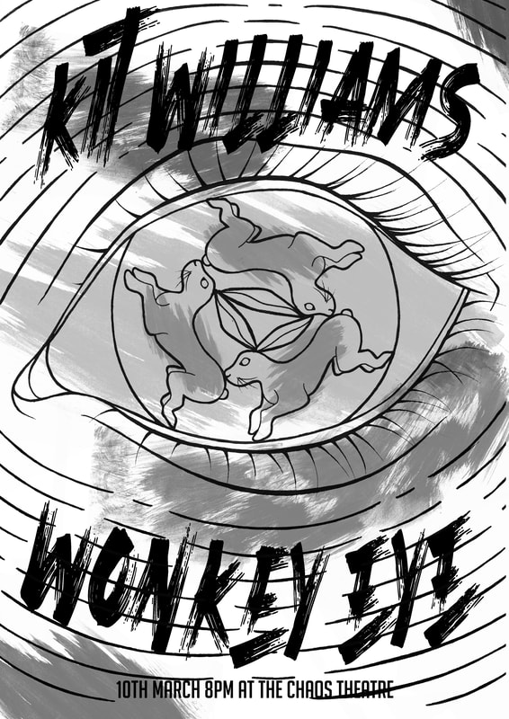
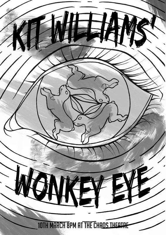
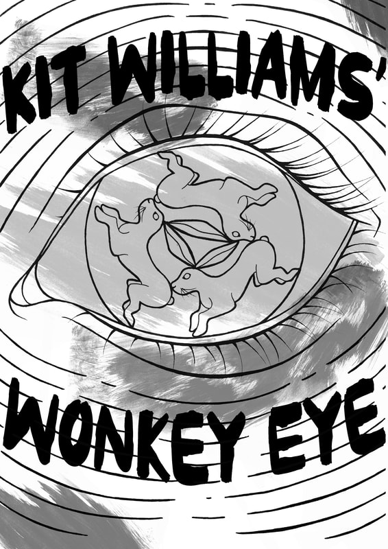
First, I played around with typefaces. I experimented with different effect on photoshop, such as fish eye distortion on the text to try and fit a suitable "folk rock" vibe I was trying to accomplish with my poster. |
|



|
Here is a lost of all the fonts I used in the type experimentations. I eventually decided to use the bottom font. |
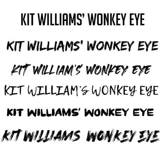
|
I then played around with the colour palettes. I was inspired by the colours of old rock band posters, and I tried to create more nature based palettes as well, to go along with the "Folk Rock" theme of the band.
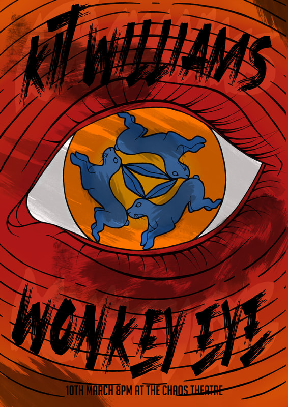
|
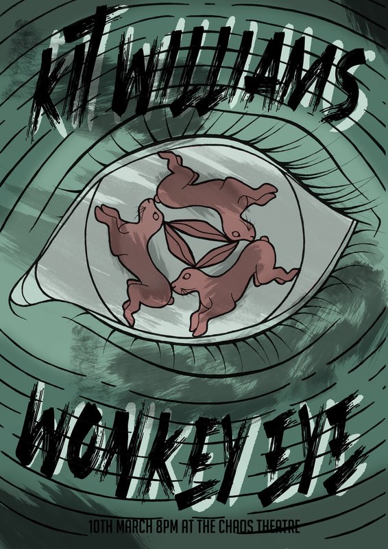
|
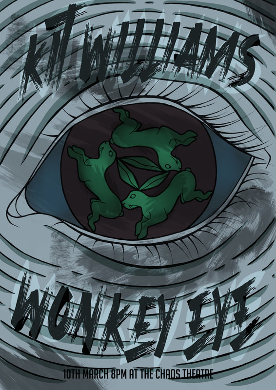
|
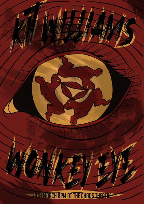
|
Here are the final results - plain and then with paper textures.
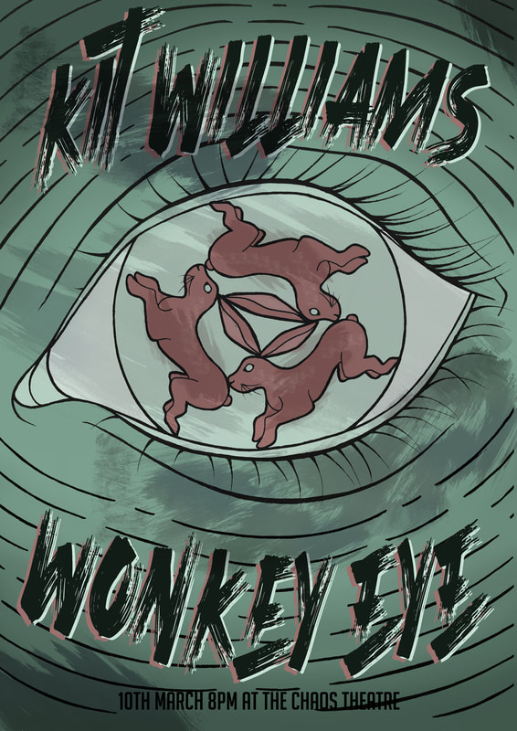
|
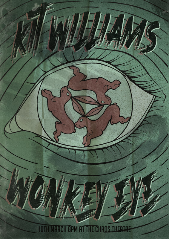
|
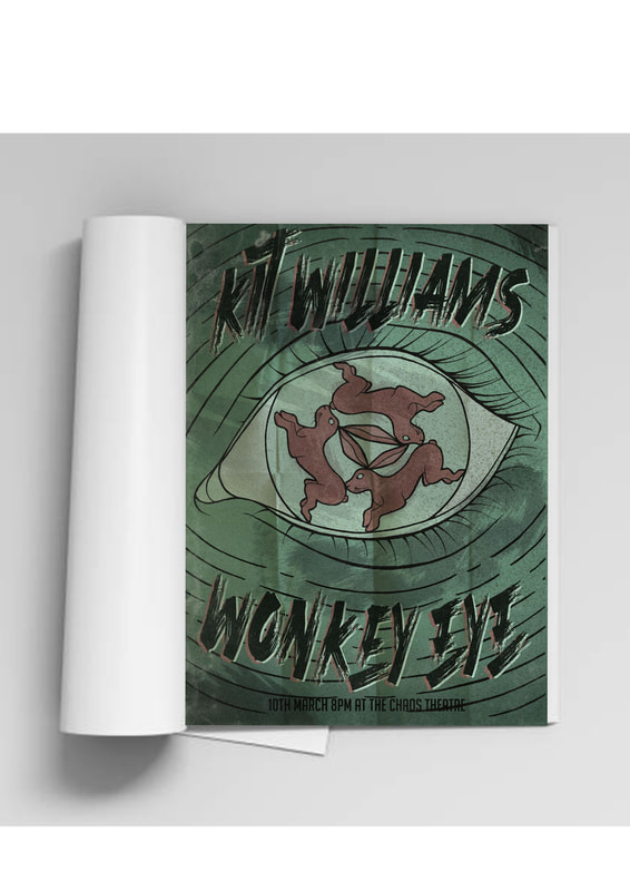
Project 2 - Illustrator
Brief - You will design and present a series of 3 enamel badges which are based of an existing property. You can choose an existing property or make a parody.
Using Adobe Illustrator create
- 3 enamel badge designs (use a cohesive visual narrative across all)
- Backing card design
- Logo/branding for your collection
Limit your badges to 4 pantone colours + line. There are a number of online services that produce "enamel badges" and questions you have regarding size, colour etc that can be answered by researching those sites and services.
Here are some videos that I watched on my initial dive into the world of Illustrator.
|
|
|
|
In class we were set a challenge to try and push our knowledge and understanding of illustrator even more, so that we don't focus in the design process as much, and more on the actual creation side of things.
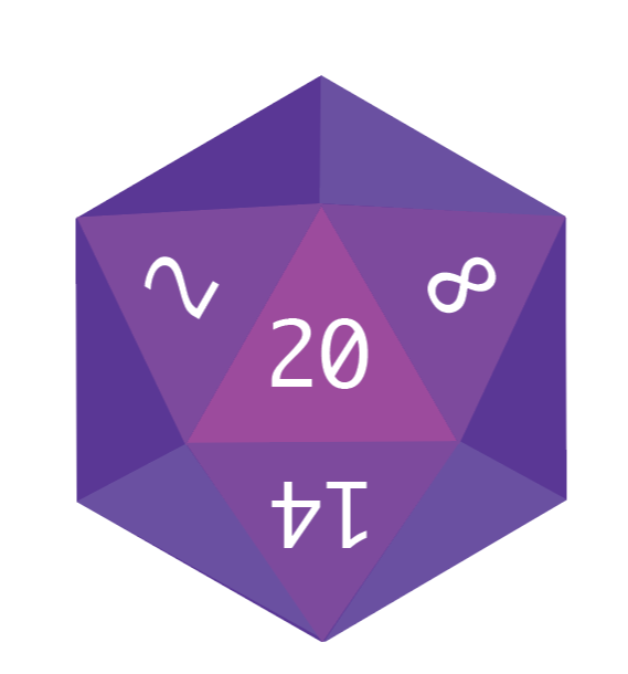
Class challenge - Create a logo/simple illustration that celebrates one of the following - Illustration - Yourself - Band/music appreciation - Movie/comic/ book character First, I attempted to create a 20 sided die - something which is used majorly when playing Dungeons and Dragons, which is my favourite pastime. I struggled with trying to warp the text on the die, so that is something I need to research more into when using Illustrator. |
|

|
I then attempted to create a pair of headphones but with the head piece being the bisexual flag. Music has always been a huge part of my life, and I am never far from my trusty pair of headphones, so I wanted to try and make a small logo of this. I was mostly successful in the creation for the striped arch, but all together it doesn't look cohesive and doesn't really resemble a set of headphones. |
|
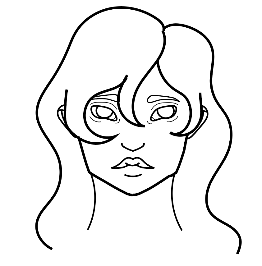
I then also quickly messed with the pencil tool to try and see what I could draw in a limited amount of time. I attempted a quick portrait, but struggled as I was using a mouse to do so. However, I liked the stability of the line that the tool granted, and how easy it was to pick up and use. I can already see how this tool will be a great help in the making of the badges. |
|
|
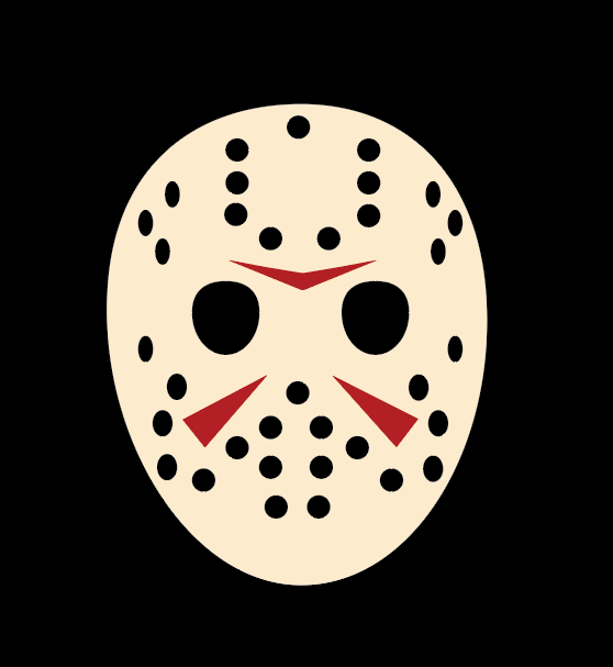
Finally, I focused on illustrating something simple but iconic, so I chose Jason Voorhees' mask from the movie franchise, Friday the 13th. The distinctive style and shape of the hockey mask was something I knew could be achieved through Illustrator, so I gave it a go and I am very happy with my results. I would like to have added some aging and shading to the yellow of the mask itself, but I was unsure how to. I will have to learn how to do this as it could be something that brings depth to my badge designs. |
Artists
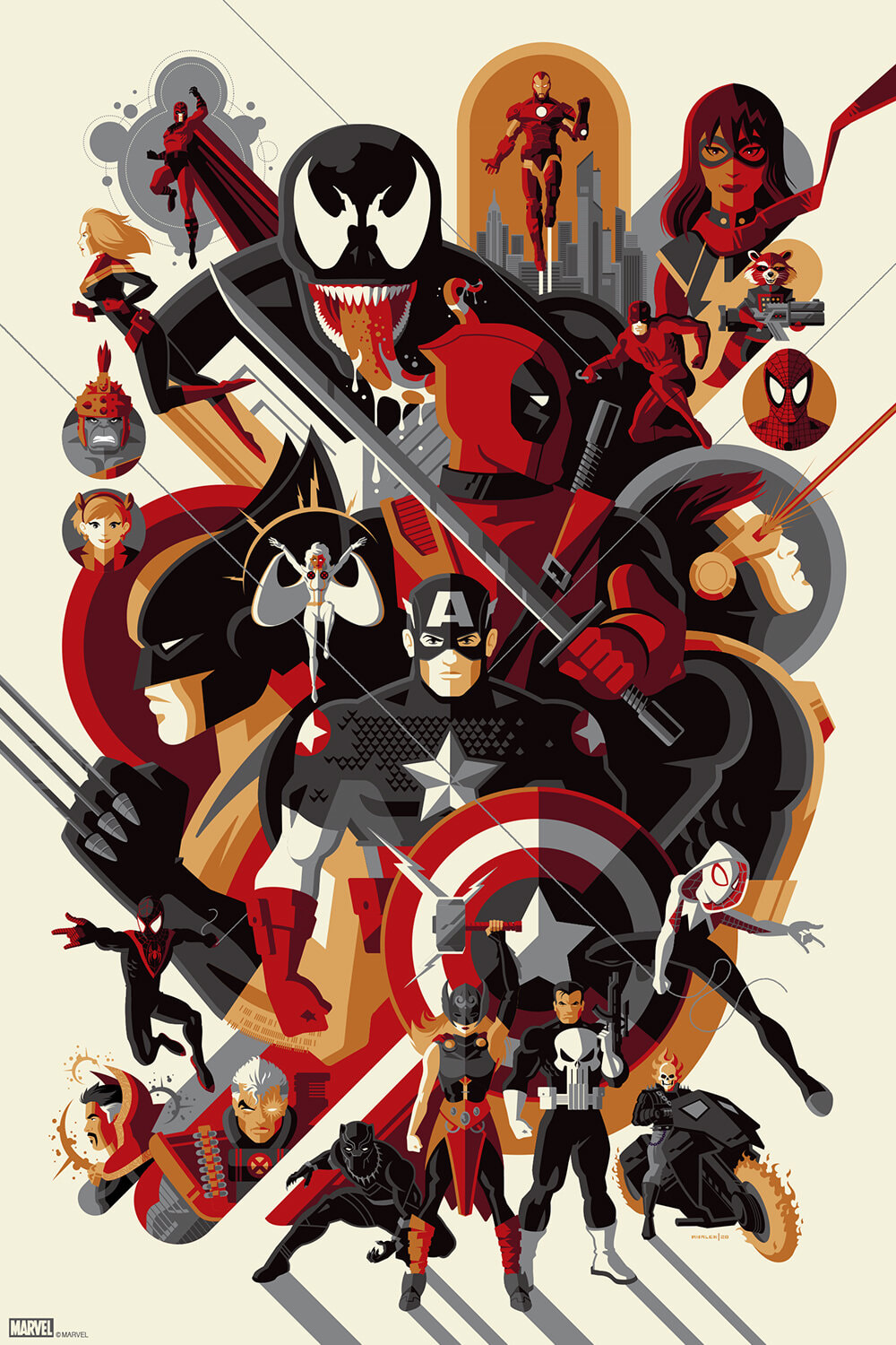
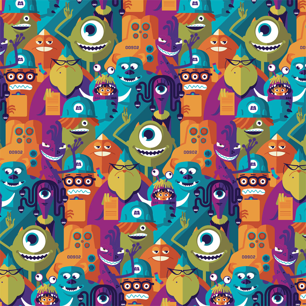
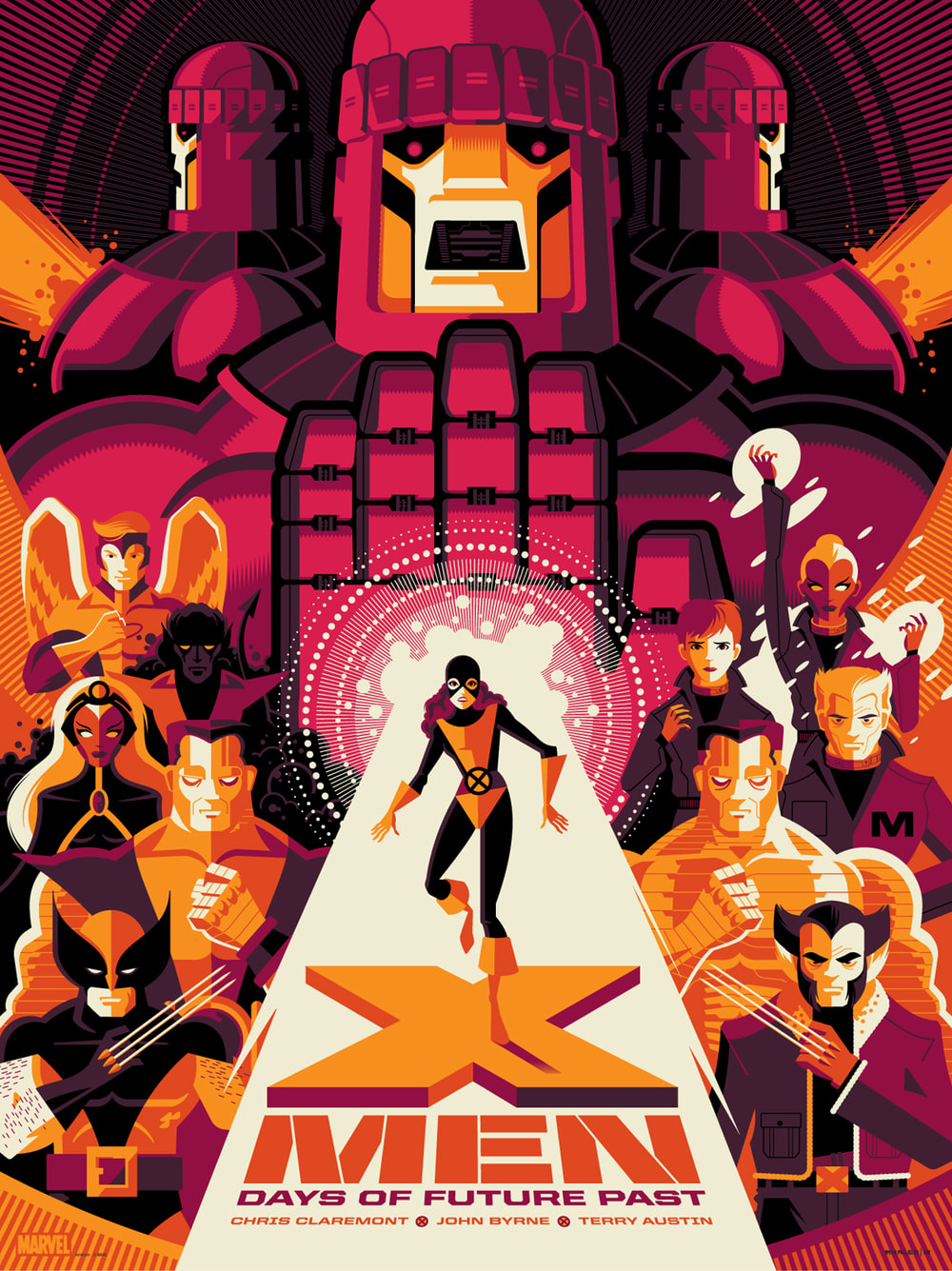
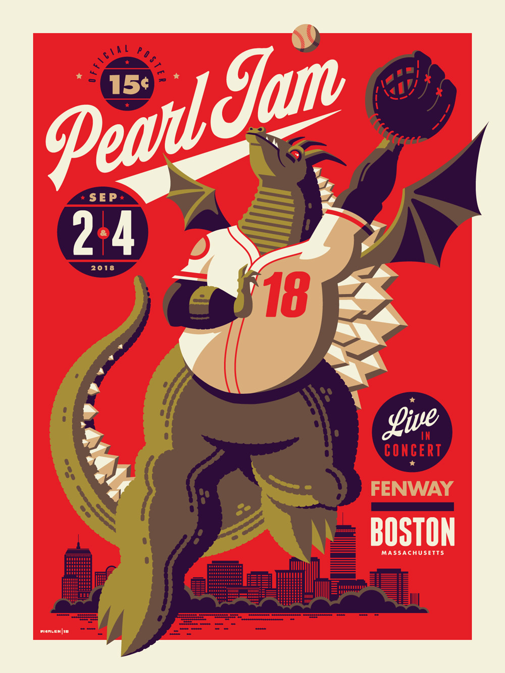
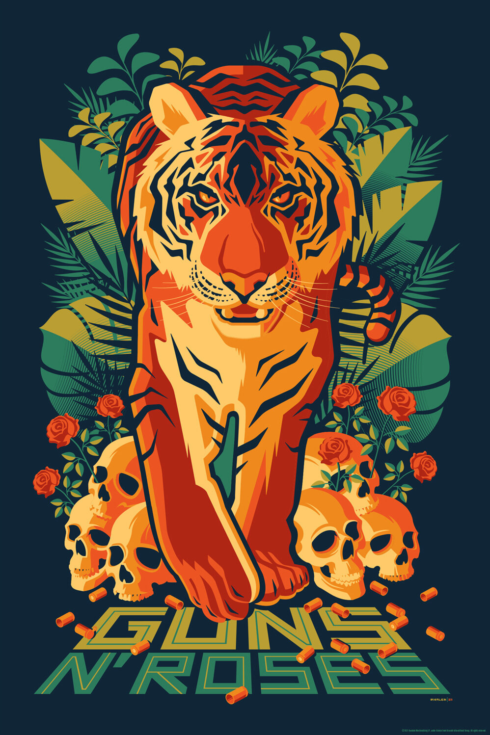
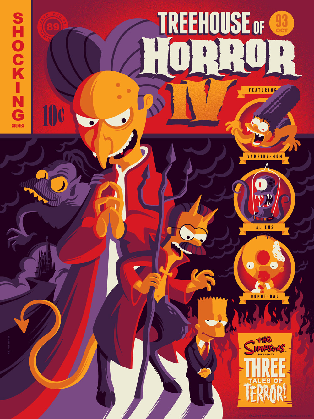
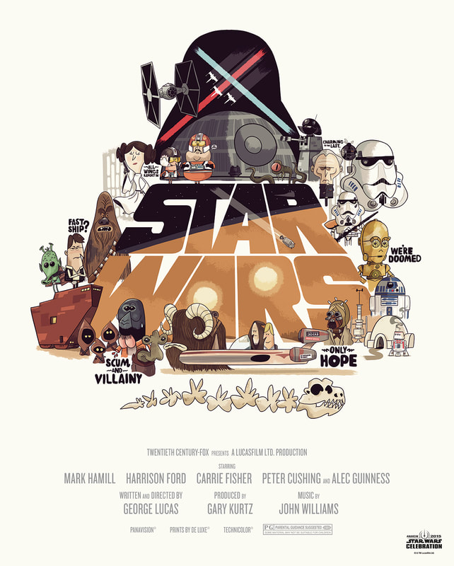
Tom WhalenTom Whalen is an American illustrator who has produced work for multiple notable clients, such as Disney, Pixar, Paramount, and Hasbro, along with many others.
Having studied both Illustration and Graphic Design at Kutztown University, one of Whalen's main focuses is illustrating movie posters - something he has had an affinity for since he was young. Whalen quotes having been inspired by "Mcfarlane, Steve Ditko, Kirby, Bass, Glaser, and Tschichold." |
|
|
|
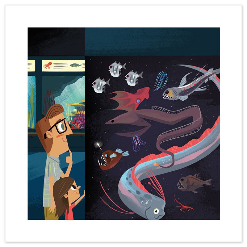
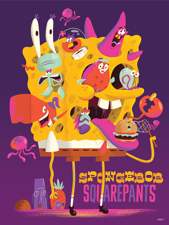
Christopher LeeChristopher Lee is an American illustrator and Multidisciplinary designer who has produced work for multiple clients, such as Adobe, Facebook, Hasbro, and Nickelodeon.
Having graduated with a degree in Graphic Design from Sacramento State, Lee has worked as an art director for a skate and urban culture magazine named Vapours, has produced toys through "various channels", and worked for the company Buck for many years before becoming freelance. |
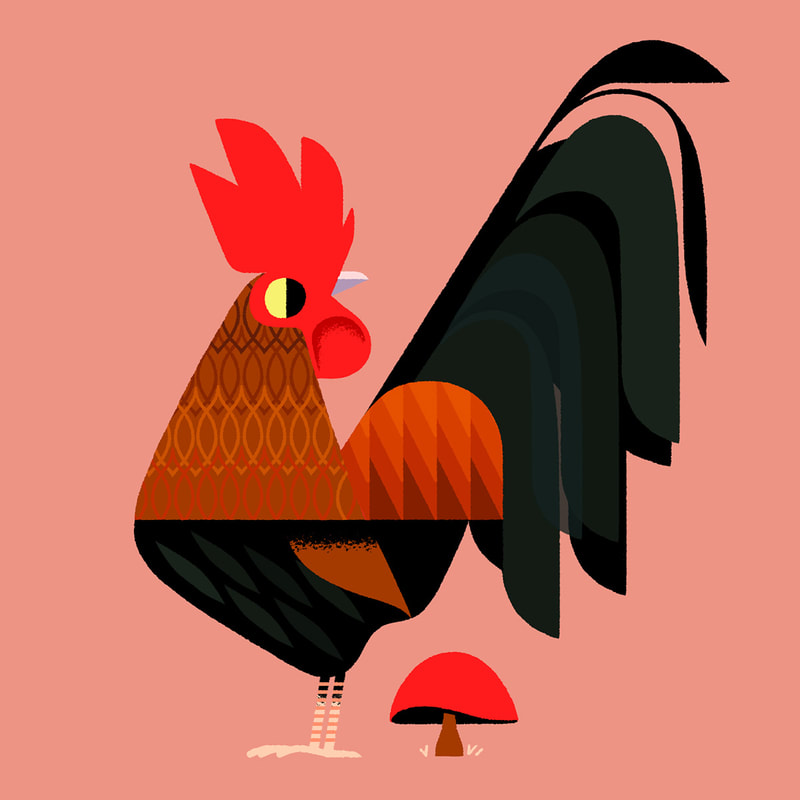
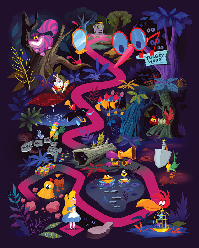
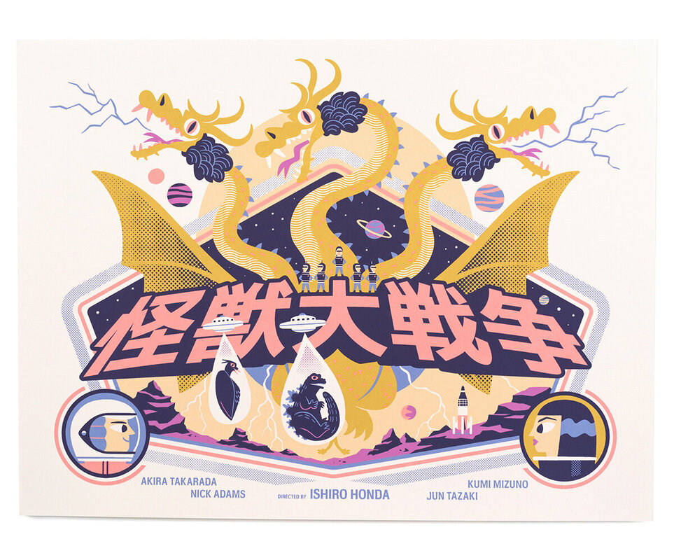
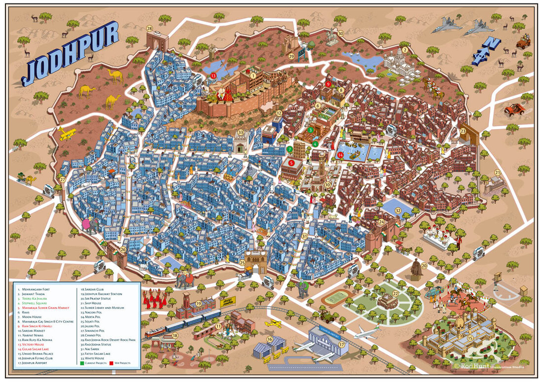
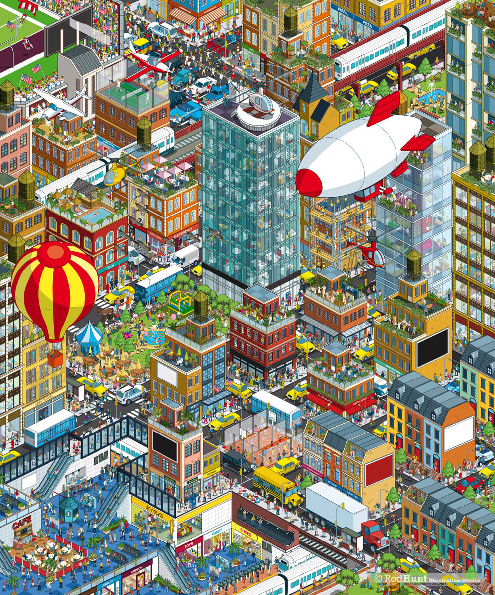
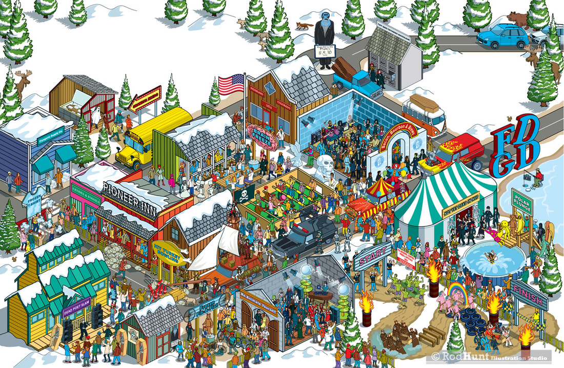
Rod HuntRod Hunt is a London based Illustrator who has produced work for many notable clients, such as the BBC, British Airways, Guinness World Records, IKEA, and Red Bull Racing.
He has had many years of experience in the industry, such as being a Chairman of the Association of Illustrators for 4 years, and a Director for 9 years. Hunt often uses his industry knowledge to give talks at conferences, events, and universities, such as Plymouth Collage of Art. Hunt is known for his "retro tinged" illustrations and detailed landscapes. |
|
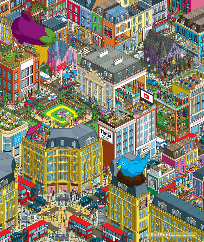
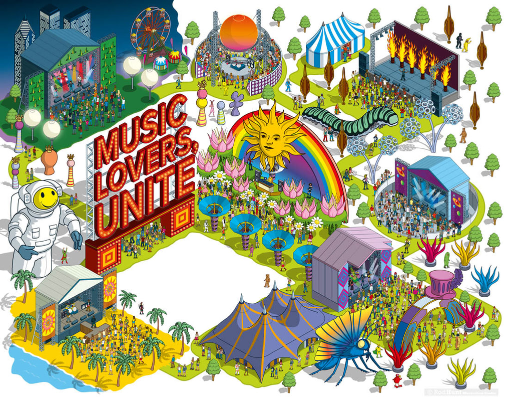
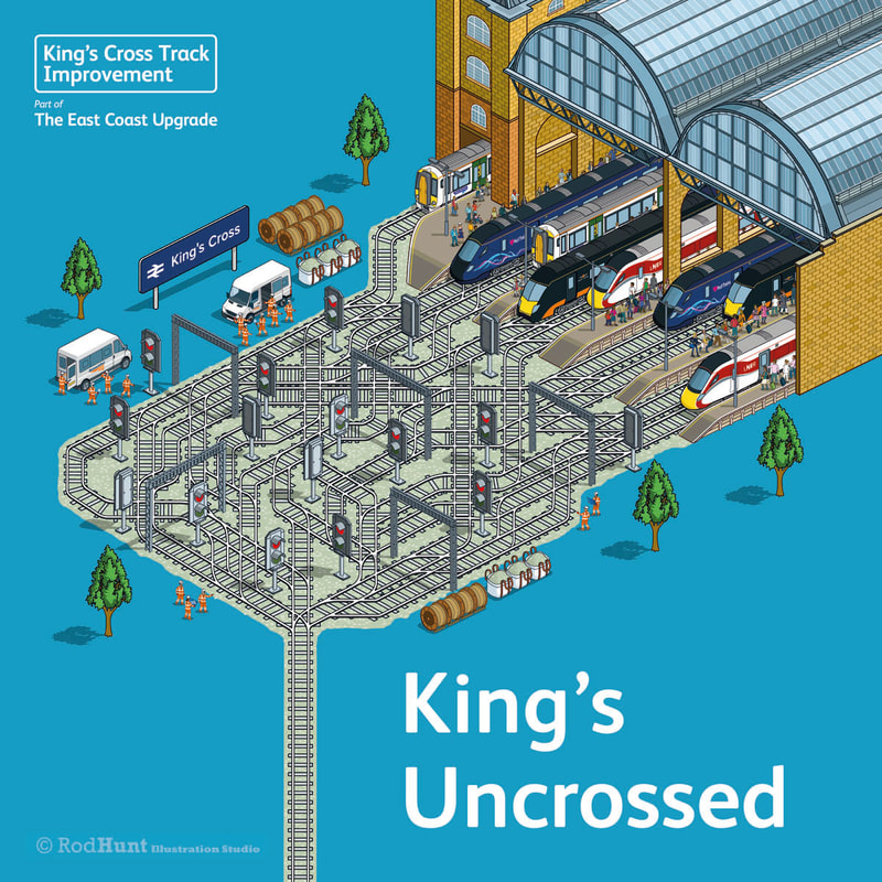
Existing Enamel Pin Designs
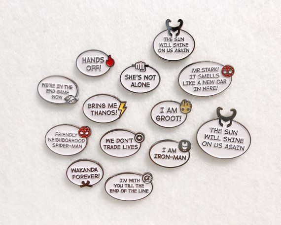
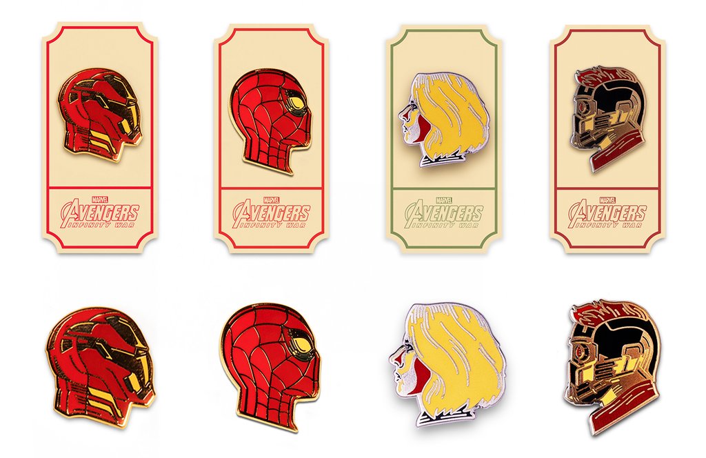
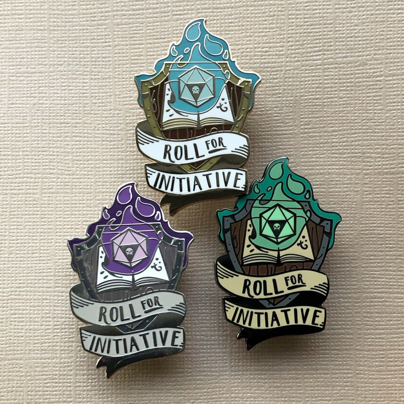
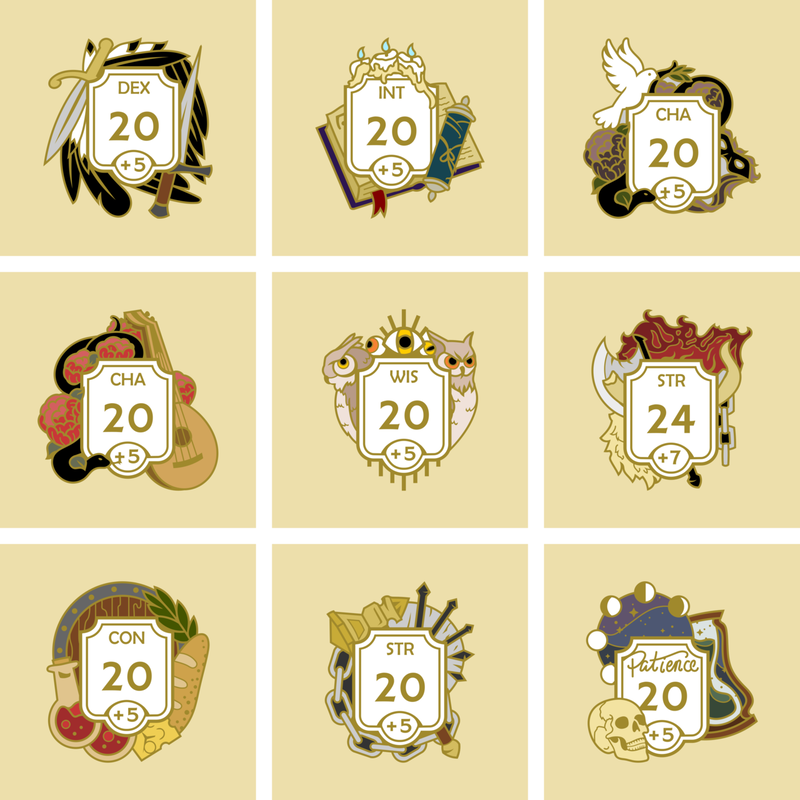
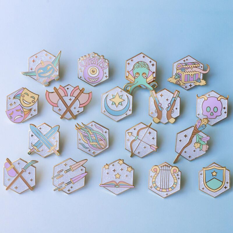
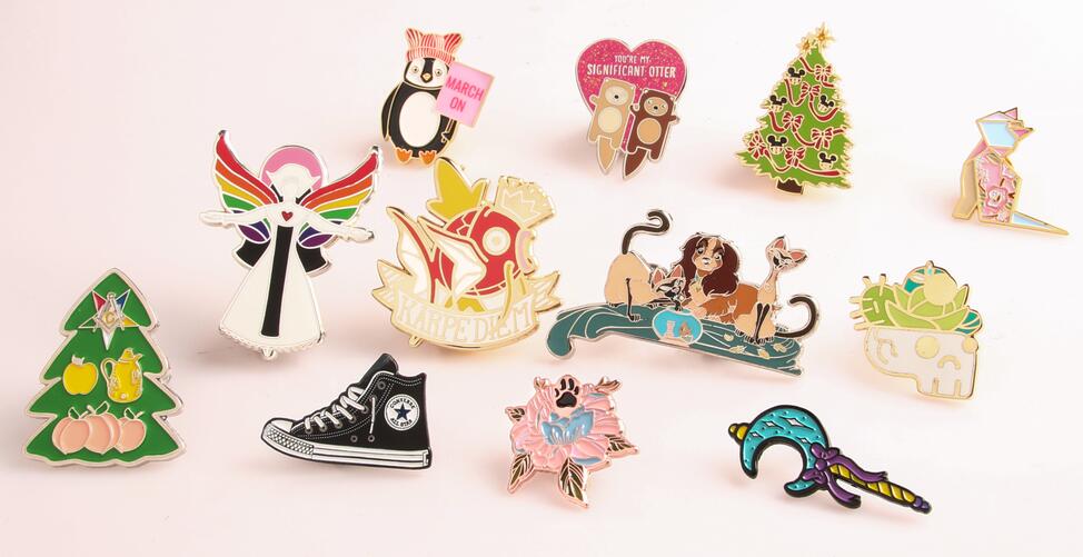
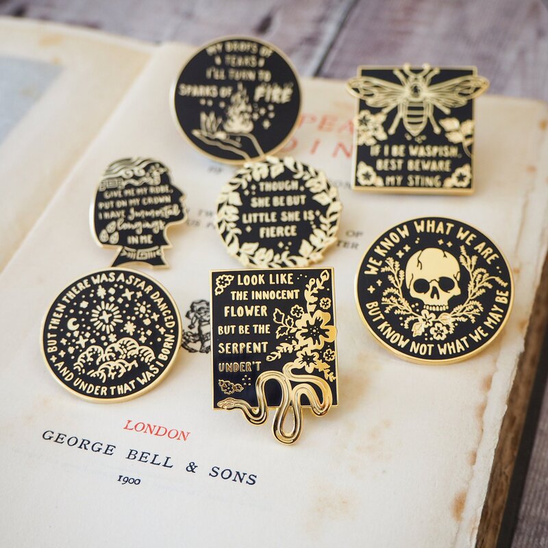
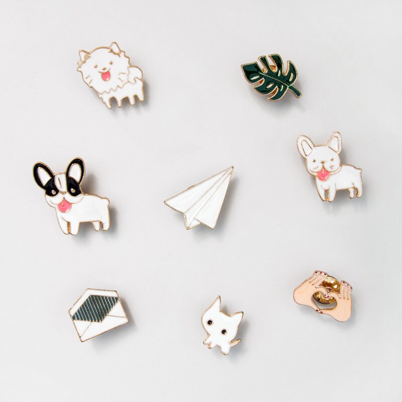
Enamel pins with text
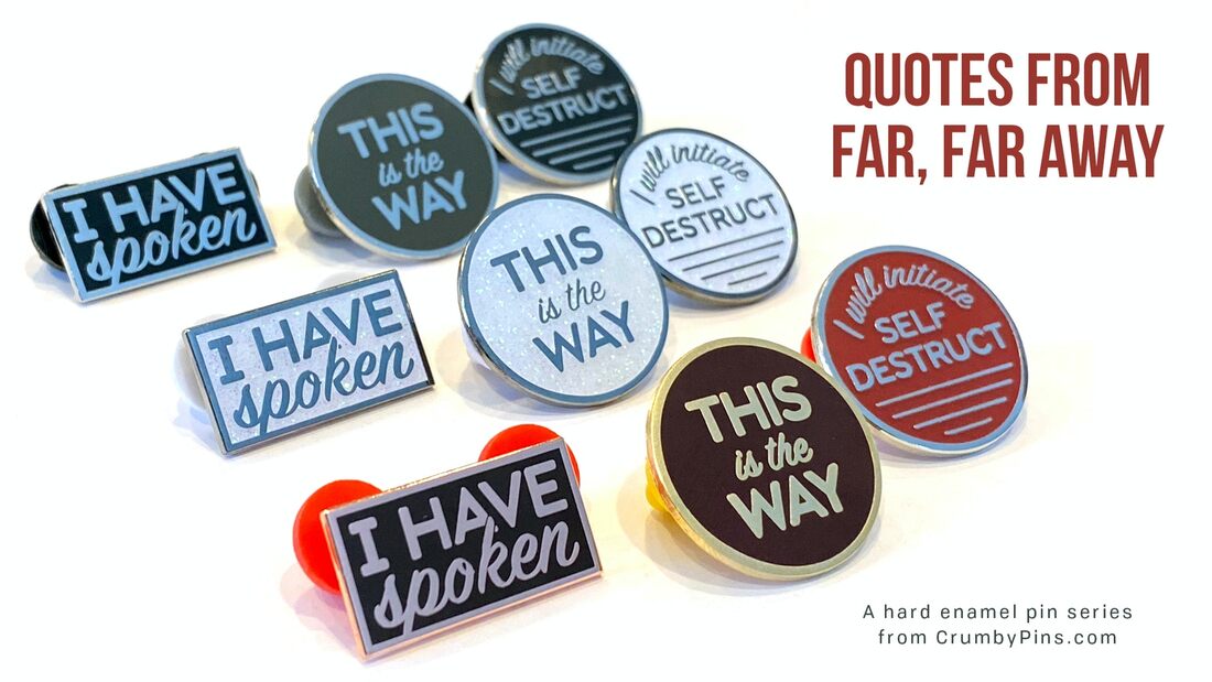
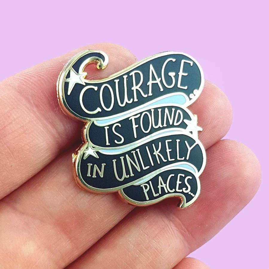
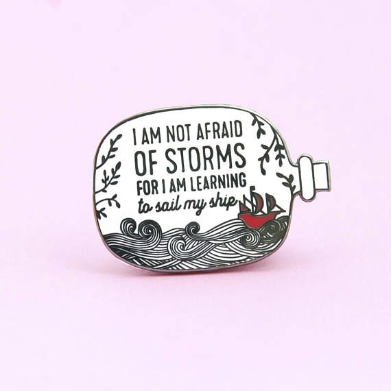
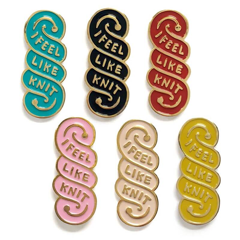
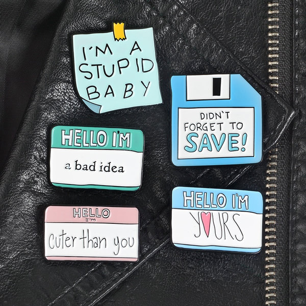
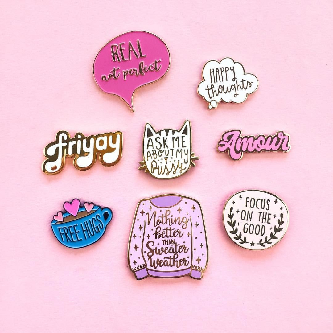
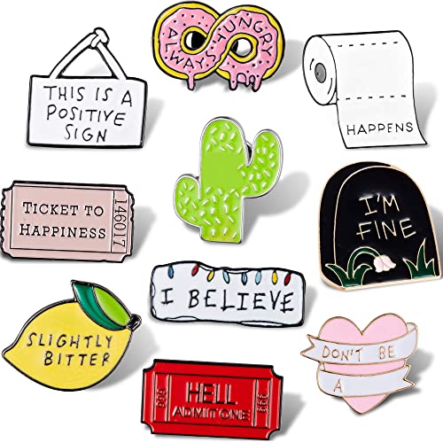
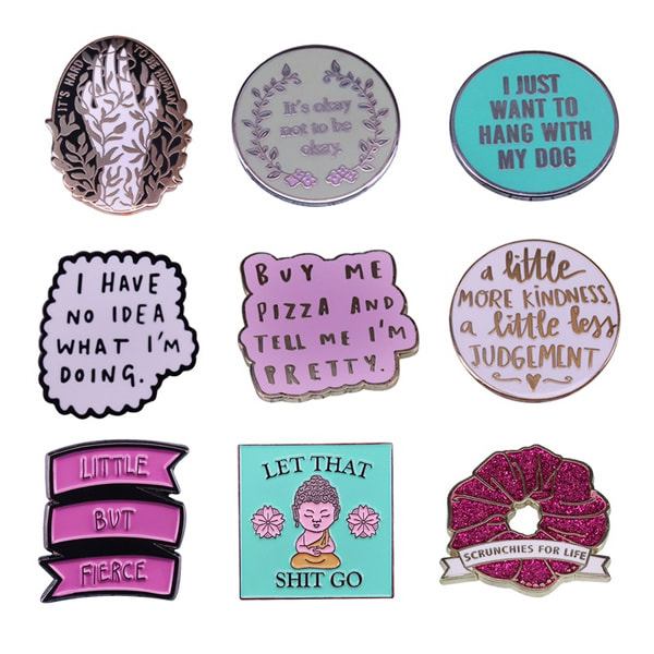
Design Process
|
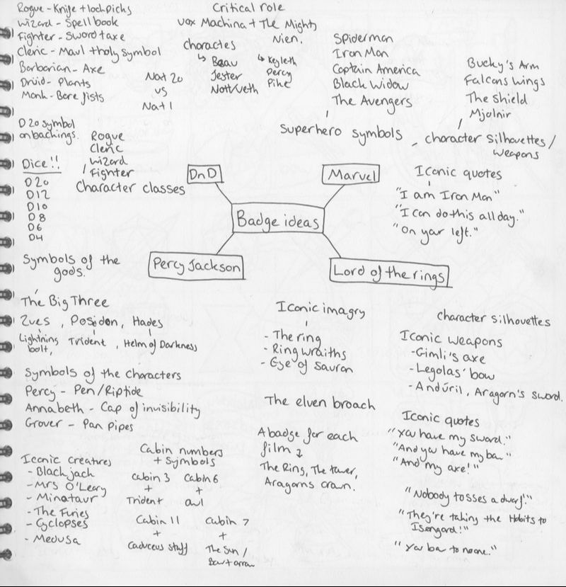
I initially started out with a mind map of ideas, as a quick way to generate a large quantity of material to pick from. I knew that I wanted to have my badges be fantasy inspired, so I gravitated towards media based off my interests, such as Dungeons and Dragons, Percy Jackson, and Lord of The Rings. I tried to focus on iconic trios within the chosen media, which also helped me narrow my preferences down towards the end. |
|
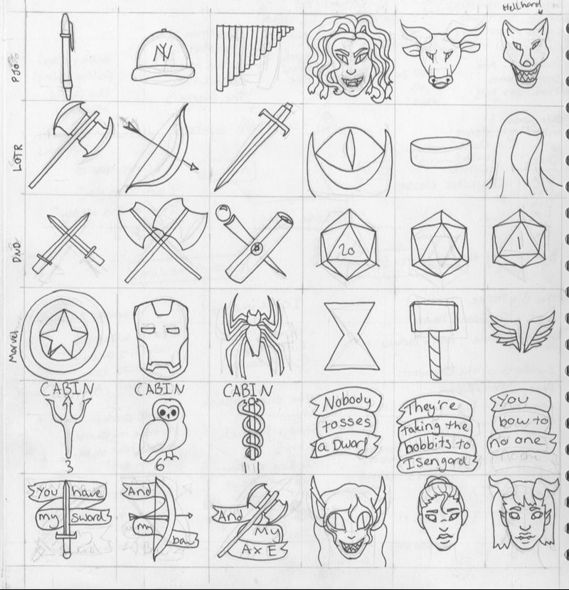
|
I then progressed by sketching out a few incredibly quick and rough initial design ideas for the medias I came up with. This allowed mw to quickly figure out which concepts could work as pins, and which could not. I tried to focus on making the designs simple and readable, so that they could be recognised from a distance. |
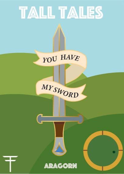
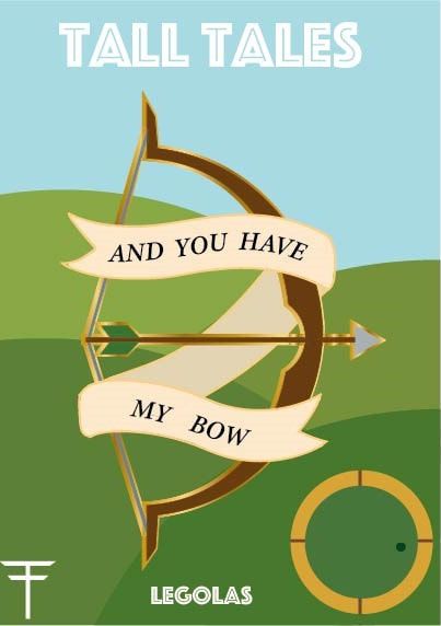
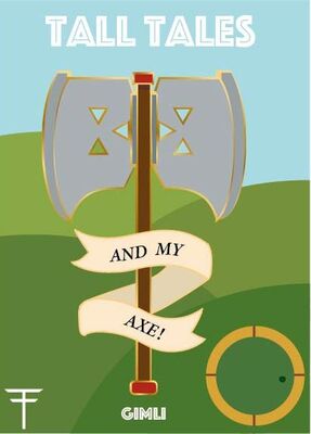
It was here where I decided to focus on my Lord of The Rings designs. I chose to illustrate the iconic trio of lines from Aragorn, Legolas, and Gimli during the Council of Elrond scene. The reason I chose these quotes is because they all work well together in a set - they are three lines of dialog that follow and link to each other, which is something that can easily be interpreted and made into a concise and readable pin set.
Here I played around with the silhouette of the pins, and how to incorporate both the quote and the weaponry into a readable pin. I eventually decided to choose the design with the scroll text wrapping in front of the weaponry, as the parchment like paper are reminiscent of high fantasy elements, and help tie the pin to their source material.
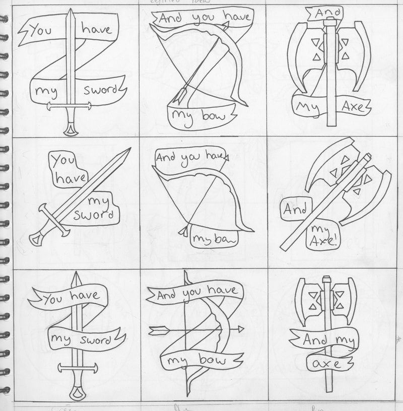
|
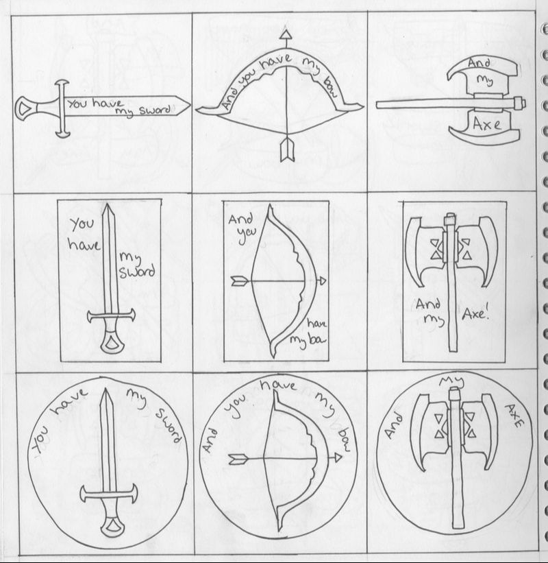
|
|
Afterwards came my attempts at designing the backing cards for the pins.
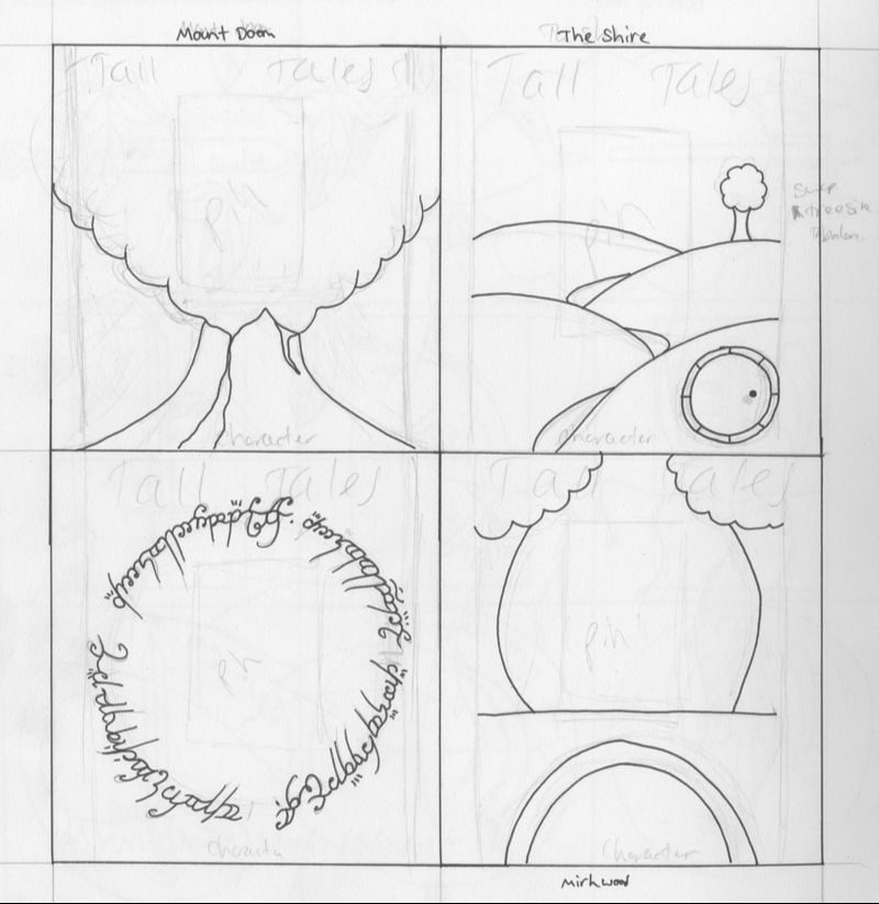
I wanted to stick to a natural theme, to tie the pins back to the beautiful scenery that is often found within the Lord of the Rings movies. My first set of ideas weren't very successful, but after I focused more on iconic imagery from the films I was able to create a more pulled together design. I drew Mount Doom, The Shire, the Elvish script on the One Ring, and the bridge into Mirkwood. I eventually decided I would use the Shire design, as it is one of the most iconic images from the series, and is well recognised around the world. |
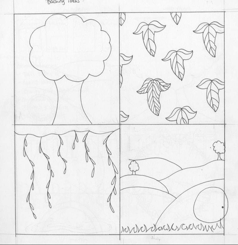
|
|
|
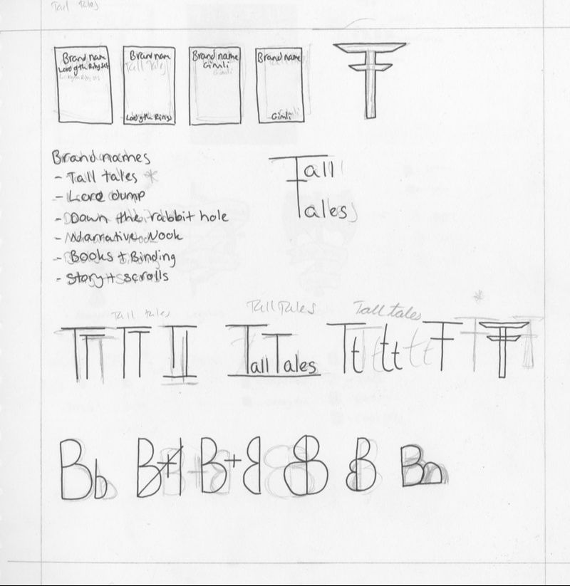
After some quick brainstorming, I came up with the name and logo for the pin sets. "Tall Tales" could work as an overarching brand for multiple sets of pop culture or well known literary pins, which is why I chose the name. |
|
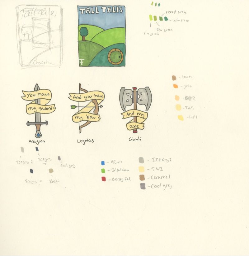
Finally, I decided on some simplistic colours for both the card and the pin designs. I tried to stick to as limited a colour palette as possible that would tie everything together, but I also though a slight splash of colour for each characters pins would be visually interesting as well. Blue for Aragorn, green for Legolas, and red for Gimli. |
|
Here are some Youtube videos that I watched in the process of creating my badges.
|
|
|

|
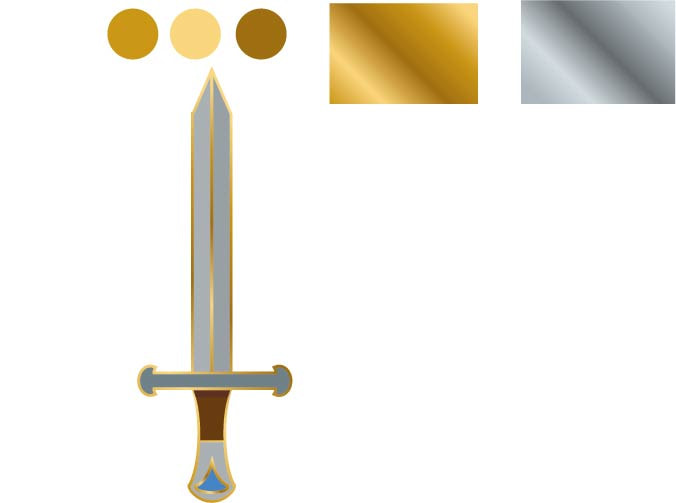
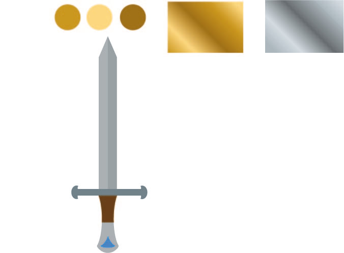
I started by following along with the video above, and creating my own metallic gradients to work from when it came to outlining my work. |
|
Then, I created my first pin, and formed a golden border around the design by following the tutorial above. I tried using the more silvery colours, but they blended in too much with the colours of the pin itself, so the golden version worked more to separate the pin from itself.
|
|
|
Following the same stylistic direction, I began to create the other pins in similar ways.
The only variations in the designs is the small pieces of colour I added to each different one to help symbolise their character and to give the eyes some more visual variance. Aragorn, King of Gondor, is given a royal blue. Legolas, elven archer, is given a forest green. Gimli, dwarven warrior, is given a bright red. |
|
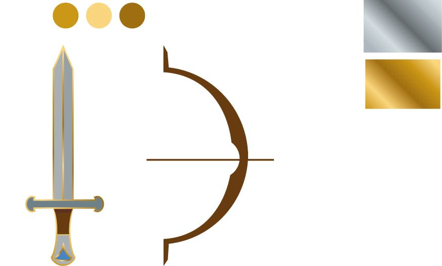
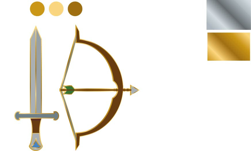
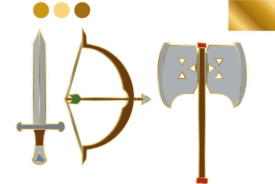
Then, I added the scrolling parchment that warps around the front of the weapons. I had to do this with the pencil tool and a brush pen to colour in the shapes, as the normal fill tool didn't work to fill in the pencil lines.
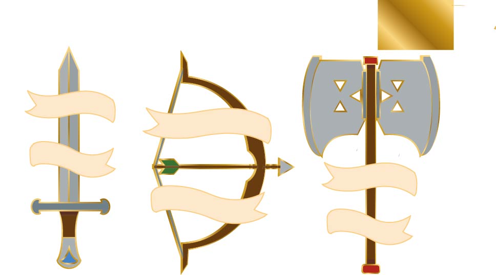
|
|
|
Then, I added text into the parchment by warping the text lines onto pen paths within the desired shapes. |
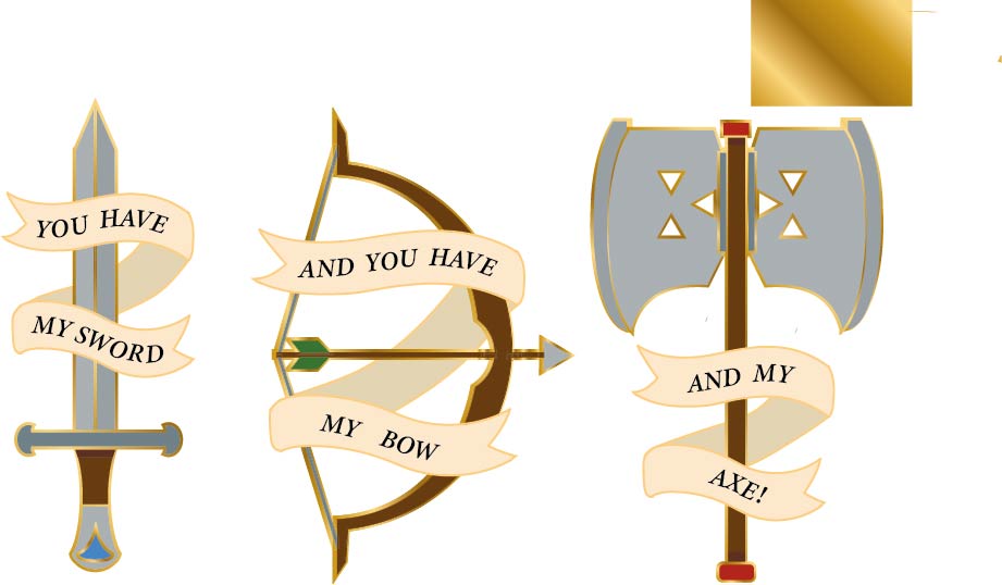
|
|
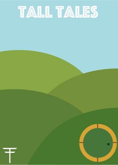
Here is the finished card backing. I added the small "Tall Tales" logo to the bottom left corner, and tried to balance it out with the iconic door from Bag End.
I am unsure as to why the quality of the image is so bad, but I will try to rectify this as quickly as possible. |
Finished pieces
|
|
|
I am unsure why the quality has degraded so much on these images, so I will attempt to rectify this soon.