- Illustration History and Practice -
Illustration History and Practice Session 1 Notes
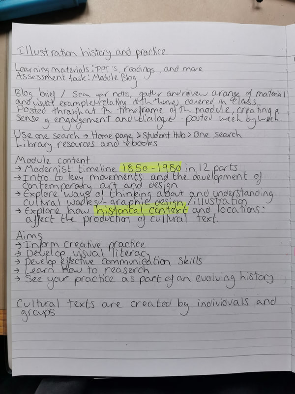
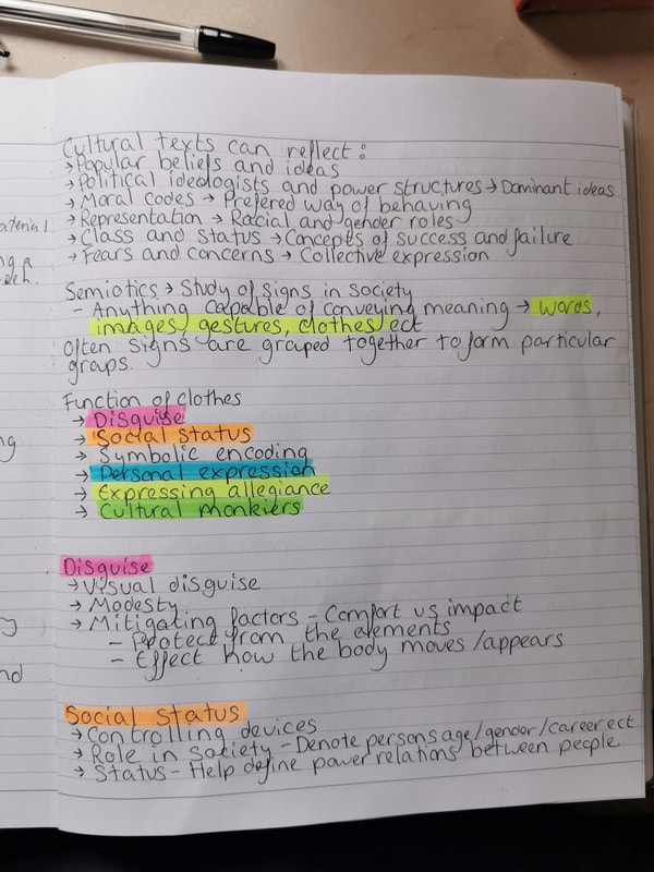
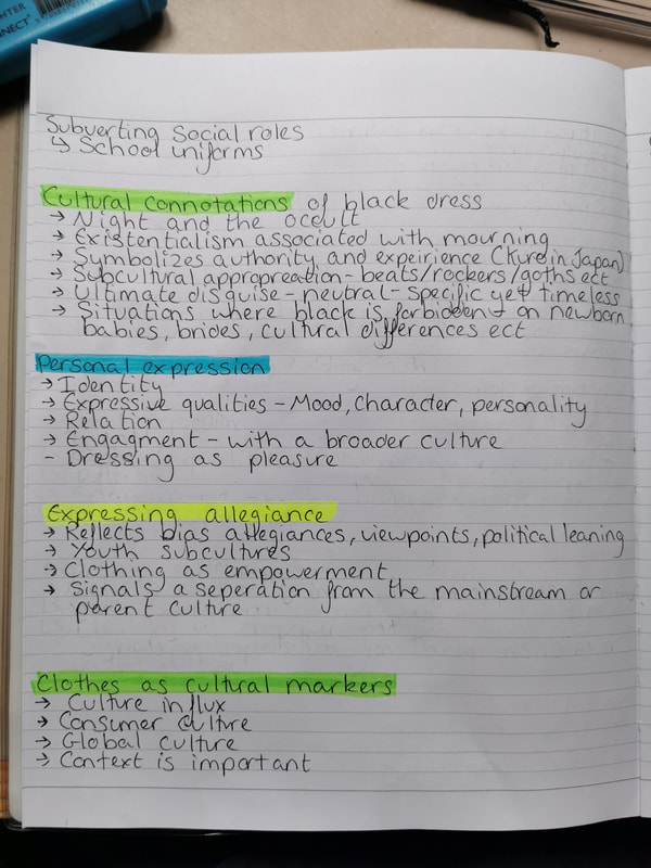
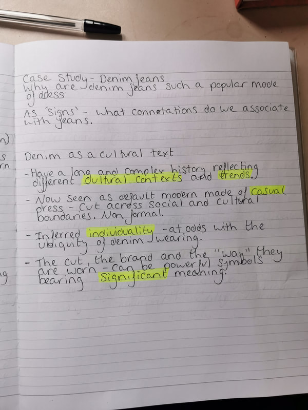
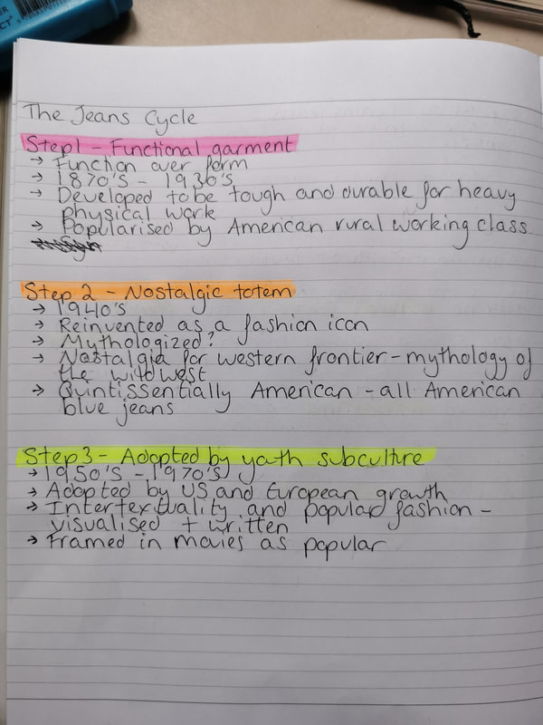
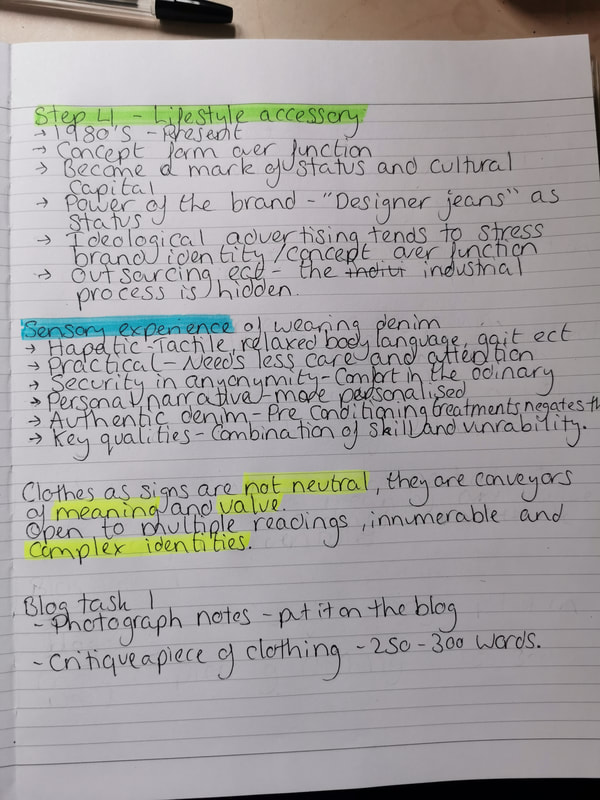
Session 1
Blog Task -
Blog Task -
- Make a functioning website
- Analyse an item of clothing from your own website - draw upon key ideas from the session - how a cultural text (ie a piece of clothing) can reflect the culture in which it was created.
|
|
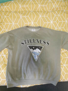
I have chosen to critique my favourite article of clothing, a green oversized jumper from the shop Pull & Bear, from their Pacific Republic line. It’s long sleeved with a thin fleece lining, and utilizes both embroidery and print on the chest to make the design. The main fabric of this jumper is composed of 83% cotton and 17% polyester, whilst the secondary fabric is 98% cotton and 2% elastane, which is a generic term for lycra.
This jumper was manufactured in Portugal, and while researching Pull & Bear as a company, I saw that they had a section on their website discussing the UK Act on Modern Slavery. Although Pull & Bear is still a fast fashion brand, which means they still contribute to the pollution that is created by textile production (which is the 2nd largest polluter of water globally), they have made some attempts to be more environmentally friendly, such as publishing their catalogues online to help prevent waste paper and supporting reforestation efforts in Mexico in 2008. In 2017 they developed an environmental project involving waste collection and recycling, as well as launching the Join Life collection, which were all created by using sustainable raw materials and processes. Although I am attempting to try and shop less at fast fashion stores, they are cheaper and more accessible to the larger public and to those with not a lot of money.
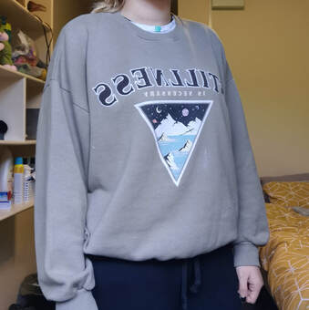
Although the measurements of the jumper are a size above my own, I prefer to wear baggier shirts and jumpers in day to day life. As this jumper is both a larger size and fleece lined, it helps keep me warm in the colder weather, and means I sometimes don’t need to wear a jacket when outside. The sleeves are easy to roll up and stay pushed up when doing tasks, and it is stained from paint from the countless times I have worn it. I prefer this jumper because of the practicalities of the design, rather than how it makes me look.
There are some cultural connotations linked to over sized clothing, most of them being that the person who wears clothing that is too big for them is trying to hide their body, probably as they are self conscious of how they look. Personally I enjoy wearing larger clothing as I find them far more comfortable than anything tighter, as it gives me a larger range of movement, and also means that I can layer things underneath if need be. Clothing for me is far more about comfort than aesthetic.
I have chosen to critique my favourite article of clothing, a green oversized jumper from the shop Pull & Bear, from their Pacific Republic line. It’s long sleeved with a thin fleece lining, and utilizes both embroidery and print on the chest to make the design. The main fabric of this jumper is composed of 83% cotton and 17% polyester, whilst the secondary fabric is 98% cotton and 2% elastane, which is a generic term for lycra.
This jumper was manufactured in Portugal, and while researching Pull & Bear as a company, I saw that they had a section on their website discussing the UK Act on Modern Slavery. Although Pull & Bear is still a fast fashion brand, which means they still contribute to the pollution that is created by textile production (which is the 2nd largest polluter of water globally), they have made some attempts to be more environmentally friendly, such as publishing their catalogues online to help prevent waste paper and supporting reforestation efforts in Mexico in 2008. In 2017 they developed an environmental project involving waste collection and recycling, as well as launching the Join Life collection, which were all created by using sustainable raw materials and processes. Although I am attempting to try and shop less at fast fashion stores, they are cheaper and more accessible to the larger public and to those with not a lot of money.
Although the measurements of the jumper are a size above my own, I prefer to wear baggier shirts and jumpers in day to day life. As this jumper is both a larger size and fleece lined, it helps keep me warm in the colder weather, and means I sometimes don’t need to wear a jacket when outside. The sleeves are easy to roll up and stay pushed up when doing tasks, and it is stained from paint from the countless times I have worn it. I prefer this jumper because of the practicalities of the design, rather than how it makes me look.
There are some cultural connotations linked to over sized clothing, most of them being that the person who wears clothing that is too big for them is trying to hide their body, probably as they are self conscious of how they look. Personally I enjoy wearing larger clothing as I find them far more comfortable than anything tighter, as it gives me a larger range of movement, and also means that I can layer things underneath if need be. Clothing for me is far more about comfort than aesthetic.
Illustration History and Practice Session 2 notes
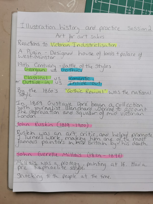
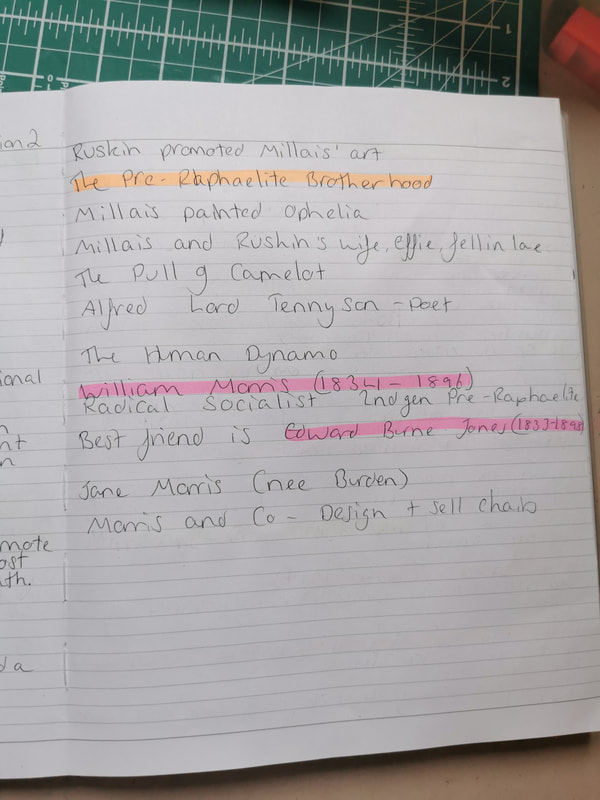
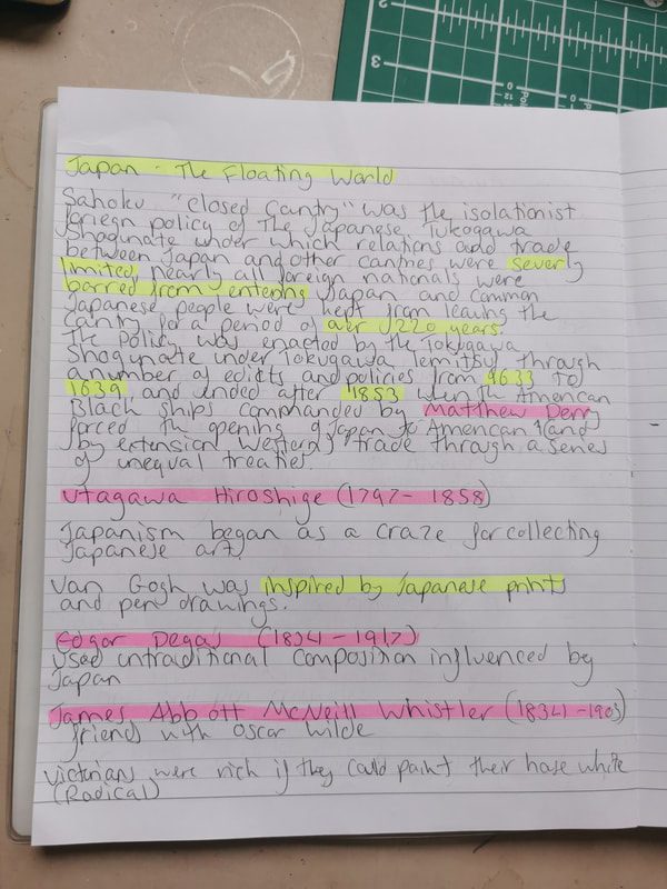
(((Weekly Task:
- Take two differing pieces of art or design from the late nineteenth or early twentieth century and explain how the Art of Japan influenced their form, function or manufacture.
- Contrast this with examples that show no influence from Japan.))) - COMPLETE LATER AND DOUBLE CHECK
Illustration History and Practice Session 3 notes
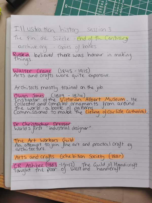
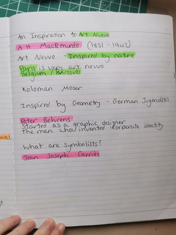
Weekly Task:
- Document, describe and explain the major differences of ‘Art Nouveau’ as it was interpreted by artists and designers in Glasgow, Vienna, Madrid and Nancy.- COMPLETE LATER AND DOUBLE CHECK
Illustration History and Practice Session 4 notes
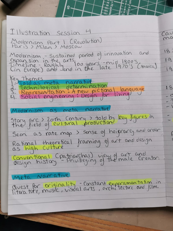
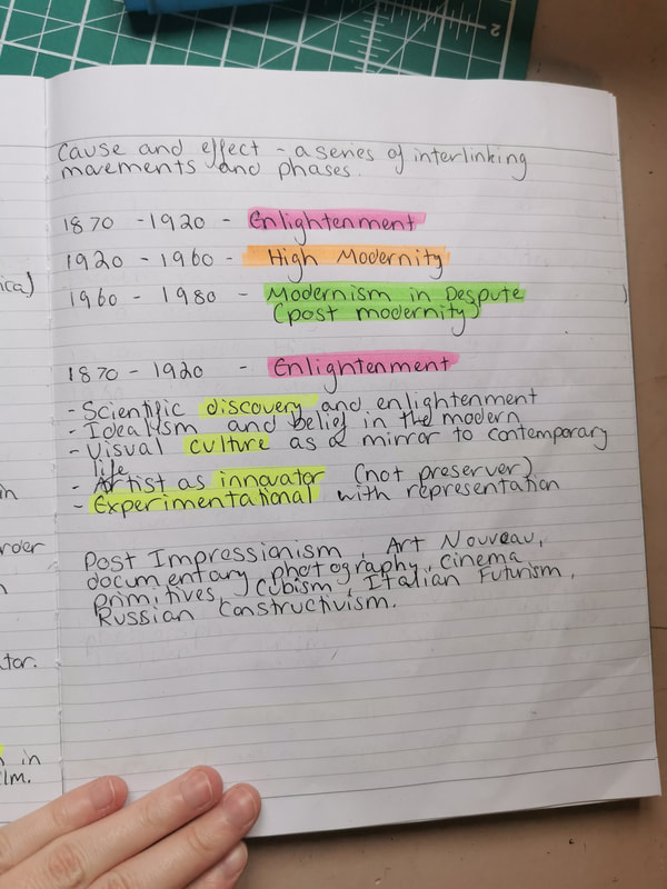
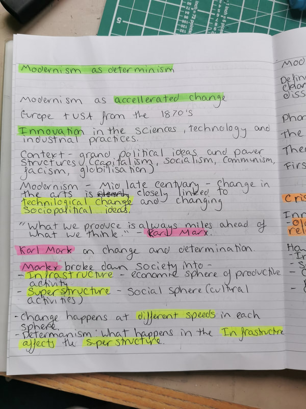
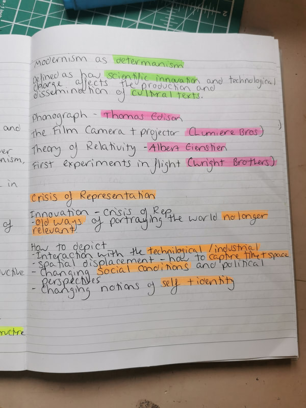
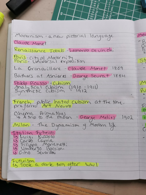
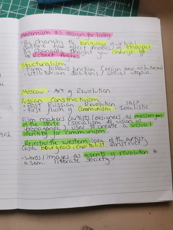
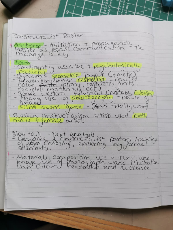
Session 4
Blog Task -
Blog Task -
- Text analysis - compare two constructivist posters/paintings of your choice.
- Exploring key formal attributes: Materials, composition, use of text, use of photography and illustration, colour, readership and audience.
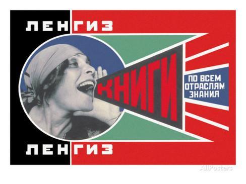
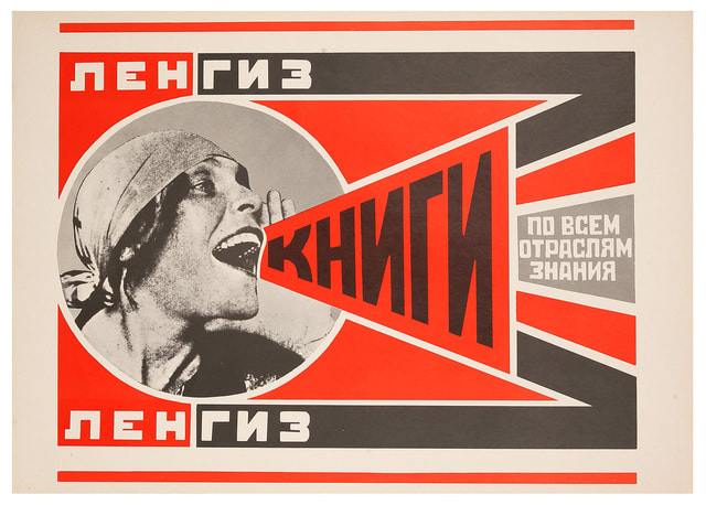
The first piece I have chosen is a poster by Alexander Rodchenko, who was one of the founders of constructivism, along with being a proficient artist, sculptor, photographer, and graphic designer. The poster is called ‘Books’ and was an advertisement for the Lengiz Publishing House.
Rodchenko seemed to have used photography and print as the materials to create the dynamic elements of this poster. This contrasts with the second poster quite a bit, as the second piece is composed mainly of illustration, while this is much more graphic in it’s feel.
This poster is much more geometric than the second poster, containing parallel lines and equal shapes, while the photograph is contained within the only non linear aspect, a circle. This succeeds in drawing the viewer's eye to the woman in the piece, and then to the text flowing from her cupped hand, as the poster has been made incredibly readable by the flow of left to right.
The text of the poster is bold, utilizing modernist typography, creating a very structured and orderly piece. This is nicely contrasted by the soft curves and naturally flowing lines of the women’s face and hair, which lets the eye take in more detail of the photograph than in the simplistic text. While this piece utilises more photographic and graphic design elements than illustration, both posters share a similarity of focus, that being of the human figure. The most eye catching aspect of the first piece is the photograph of the shouting woman, a contrast to the linear motions of the poster, and the same can be said for the second as it presents a detailed illustration of a man and woman amongst sharp lines and bold objects.
While researching this piece I found two versions of the poster, one in reds, blacks and whites, while the other utilised greens and blues along with the reds. I found this a bit odd for constructivism, as the limited colour palette usually only includes bold reds and the occasional other warm yellows and oranges, so the introduction of cold greens and blues was a contrast I wasn't expecting in this piece. As this poster was an advert for the Lengiz Publishing House, it was specifically designed to draw their eye to the poster, and to showcase all of the appropriate information needed to promote the publishing house, while appealing to people who wish to read and seek knowledge.
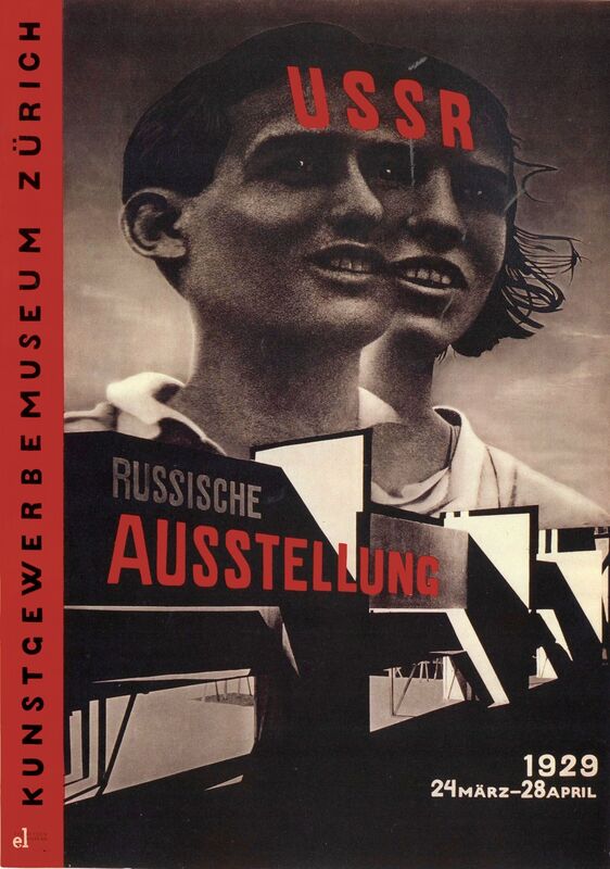
The second piece I have chosen is a poster for the Russian Exhibition in Zurich, 1929, that was made by El Lissitzky, who was a Russian artist, designer, photographer, teacher, typographer, and architect, who was an important figure in the Russian avant-garde scene.
In the piece there are two figures, a man and a woman, who are both gazing out of frame while simultaneously sharing one eye, possibly representing their equality in the state and their shared view of their country.
The materials on this piece seem to be charcoal for the illustration of the two figures, and possibly ink or print for the rest of the poster. Lissitzky used a photomontage as a reference for this piece, which was a technique he was well known for, as he launched radical innovations into photomontage and typography.
The two figures who share a single eye are gazing out of the right hand side of the poster, positioned above a building which takes up the lower half of the frame. This effectively utilises the rule of three, as the eye is drawn to the figures, then to the building, and then to the white text at the bottom of the frame. This differs from the first poster, as there is less geometry to this piece, taking on a more illustrative style, and as the poster is read vertically instead of horizontally.
While the colour pallet of this illustration is restricted to grey tones, the text however is bold and vibrant, choosing to utilise dramatic reds and pure white to contrast the monotone of the piece. Red text is stamped across the foreheads of the figures and across the main body of the building, showcasing the most important information in a bright coloured text, drawing the viewer’s eye with a bold text, making it psychologically powerful.
This poster utilises illustration more than photography, in a heavy contrast to the first piece, as photography is an element which is frequently used in constructivism posters of the time. As this is a poster showcasing the russian Exhibition at the Museum of Decorative Art in Zurich, it was potentially created for advertisement, to draw people to become more appreciative or influenced by Russian art of the time, so it would need to be visually striking to appeal to the viewers.
Illustration History and Practice Session 5 notes
Session 5
Blog Task -
Blog Task -
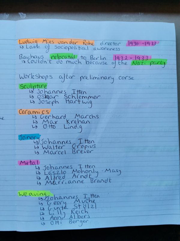
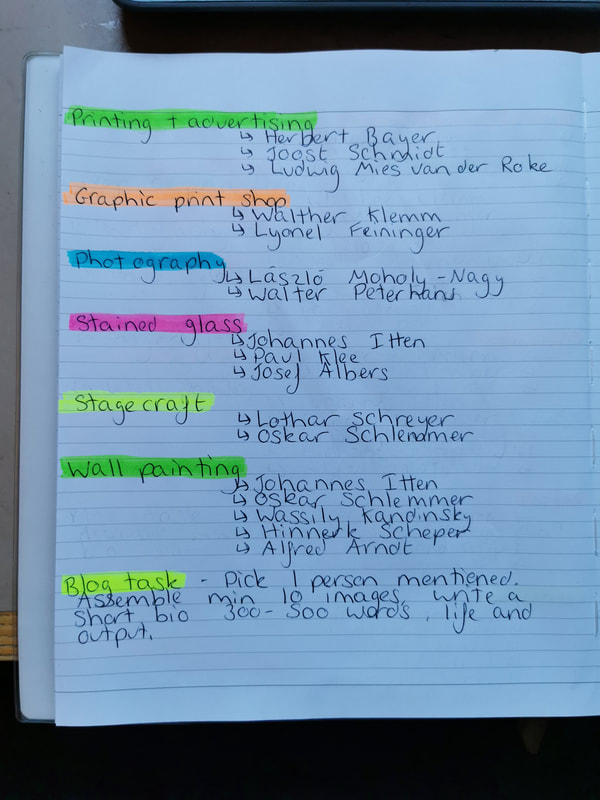
- Take one of the artists or designers mentioned in the presentation and research their life and visual output.
- Collect a minimum of 10 pieces of their work and write a short biography (300-500 words).
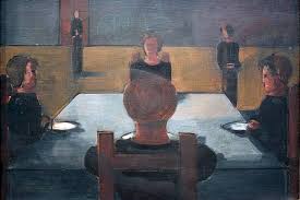
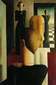
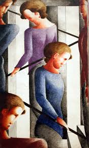
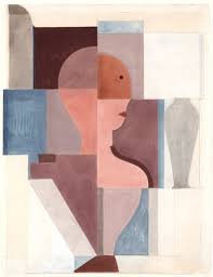
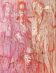
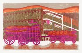
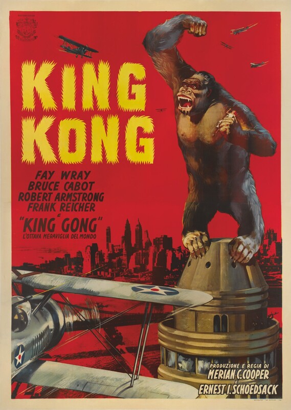
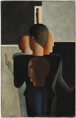
Oskar Schlemmer
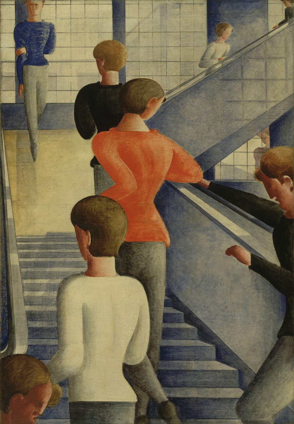
Oskar Schlemmer was a German painter, sculptor, designer, and choreographer who was employed at the Bauhaus school of Art. He was born on 4th September 1888 in Swabia, Germany, and died in hospital at Baden-Baden in 1943.
His history of Arts and Crafts started early, as at the age of 15 he was completely independent, supporting himself as an apprentice in an inlay shop, then in 1905 he began a marquetry apprenticeship which lasted till 1909. Schlemmer studied at the Kunstgewerbeschule (School of Applied Arts) in Stuttgart and won a scholarship to attend the Akademie der Bildenden Künste (Stuttgart Academy of Fine Art) in 1906 where he studied under famous painters, such as landscape painters Friedrich von Keller and Christian Landenberger.
He was enlisted to fight in 1914, but was wounded on the Western Front, leading to him being moved to a position in the military cartography unit until the end of the war.
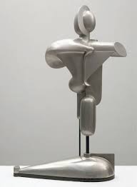
He moved to the Bauhaus School to run the mural painting and sculpture departments before taking over the stagecraft workshop from Lothar Schreyer in 1923. He was the Master of Form at the theatre workshop, and his most famous work, Triadisches Ballett (Triadic Ballet), saw costumed actors transformed into geometrical representations of the human body in what Schlemmer described as a “party of form and colour”. He also was invested in stage design, becoming involved in creating settings for the opera ‘Nightingale’ and the ballet ‘Renard’ by Igor Stravinksy
His complex ideas made him one of the most important teachers working at the Bauhaus at the time, as they were incredibly influential. His ideas on art were considered complex and challenging even for the progressibe Bauhaus movement. However, he resigned his position in 1929 due to the heightened political atmosphere in Germany at the end of the 20’s, and due to the hiring of Hannes Meyer, a radical comminist architect, and moved to work at the Art Academy in Breslau.
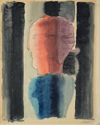
Schlemmer’s work for the Brauhaus and his fascination with the theatre was a very important factor in his work, which mostly deals with the figure in space. His style portrays people, typically stylised, faceless and female, as the predominant subjects of his paintings, and his characteristic forms can also be seen in his sculptures as well. This style choice possibly stems from his background in Impressionism, and then later into Cubism, which he used as a springboard for his structural studies, often representing the human form as architectural forms.
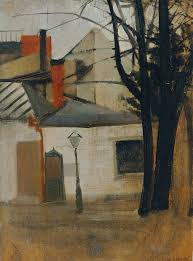
During World War II, Schlemmer worked at the Institut für Malstoffe in Wuppertal, which was run by a philanthropist called Kurt Herbert. This allowed him to paint without fear of persecution from the Nazi party, and was also where he produced his final works, eighteen small paintings called “Fensterbilder” (Window Pictures). They were painted while looking out of the window of his house, observing neighbours engaged in various domestic tasks. He died soon after in a hospital in Baden-Baden.
Oskar Schlemmer was a German painter, sculptor, designer, and choreographer who was employed at the Bauhaus school of Art. He was born on 4th September 1888 in Swabia, Germany, and died in hospital at Baden-Baden in 1943.
His history of Arts and Crafts started early, as at the age of 15 he was completely independent, supporting himself as an apprentice in an inlay shop, then in 1905 he began a marquetry apprenticeship which lasted till 1909. Schlemmer studied at the Kunstgewerbeschule (School of Applied Arts) in Stuttgart and won a scholarship to attend the Akademie der Bildenden Künste (Stuttgart Academy of Fine Art) in 1906 where he studied under famous painters, such as landscape painters Friedrich von Keller and Christian Landenberger.
He was enlisted to fight in 1914, but was wounded on the Western Front, leading to him being moved to a position in the military cartography unit until the end of the war.
He moved to the Bauhaus School to run the mural painting and sculpture departments before taking over the stagecraft workshop from Lothar Schreyer in 1923. He was the Master of Form at the theatre workshop, and his most famous work, Triadisches Ballett (Triadic Ballet), saw costumed actors transformed into geometrical representations of the human body in what Schlemmer described as a “party of form and colour”. He also was invested in stage design, becoming involved in creating settings for the opera ‘Nightingale’ and the ballet ‘Renard’ by Igor Stravinksy
His complex ideas made him one of the most important teachers working at the Bauhaus at the time, as they were incredibly influential. His ideas on art were considered complex and challenging even for the progressibe Bauhaus movement. However, he resigned his position in 1929 due to the heightened political atmosphere in Germany at the end of the 20’s, and due to the hiring of Hannes Meyer, a radical comminist architect, and moved to work at the Art Academy in Breslau.
Schlemmer’s work for the Brauhaus and his fascination with the theatre was a very important factor in his work, which mostly deals with the figure in space. His style portrays people, typically stylised, faceless and female, as the predominant subjects of his paintings, and his characteristic forms can also be seen in his sculptures as well. This style choice possibly stems from his background in Impressionism, and then later into Cubism, which he used as a springboard for his structural studies, often representing the human form as architectural forms.
During World War II, Schlemmer worked at the Institut für Malstoffe in Wuppertal, which was run by a philanthropist called Kurt Herbert. This allowed him to paint without fear of persecution from the Nazi party, and was also where he produced his final works, eighteen small paintings called “Fensterbilder” (Window Pictures). They were painted while looking out of the window of his house, observing neighbours engaged in various domestic tasks. He died soon after in a hospital in Baden-Baden.
Illustration History and Practice Session 6 notes
Session 6
Blog Task -
Blog Task -
- Take one of the artists or designers mentioned in the presentation and research their life and visual output.
- Collect a minimum of 10 pieces of their work and write a short biography (300-500 words).
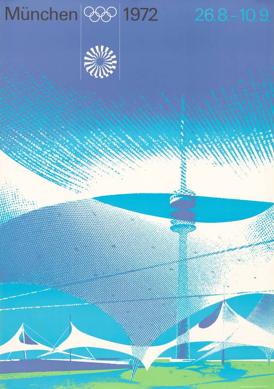

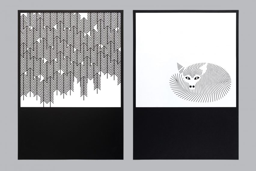
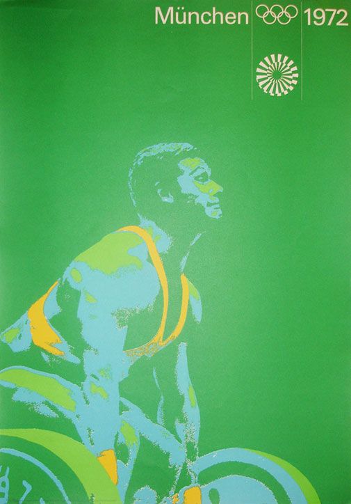
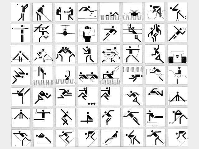
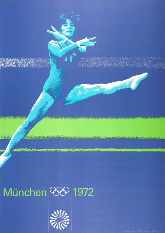
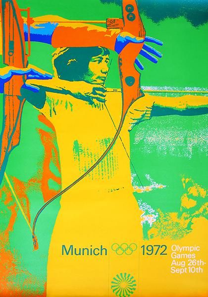
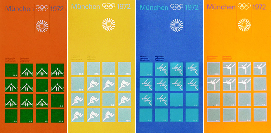
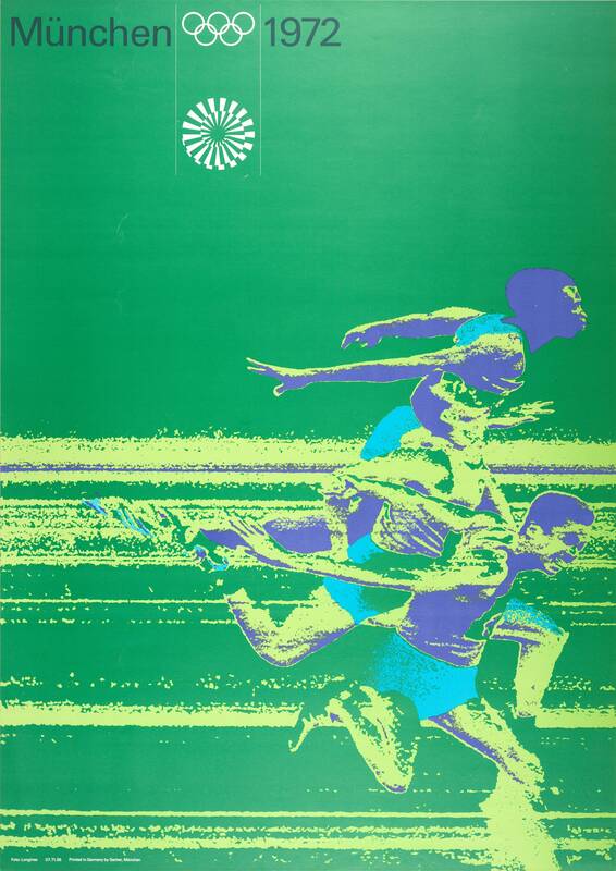
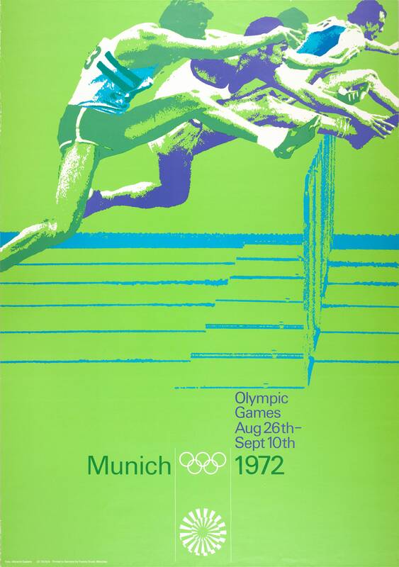
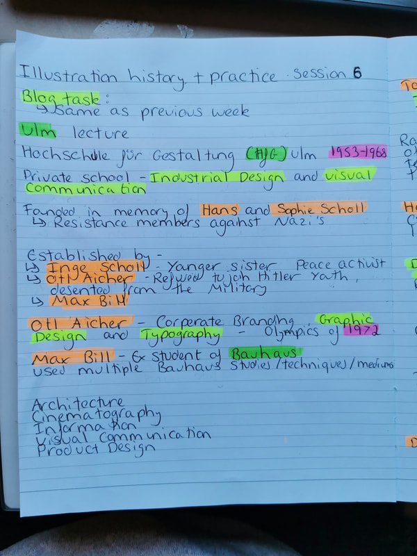
Otl Aicher was a German graphic designer and typographer who was best known for his role in co-founding the Ulm School of Design, and for designing pictograms for the 1972 Olympics in Munich. He was born on the 13th of may 1922 in Baden-Württemberg, Germany and died on the 1st of September, 1991.
Despite being raised in Nazi Germany, Aicher was strongly opposed to their movement, and was arrested at 15 for refusing to join the Hitler Youth. Although he was drafted into the German Army to fight in WWII, he attempted to leave multiple times, finally deserting in 1945 before going into hiding.
After the end of the war Aicher began studying sculpture at the Academy of Fine Arts in Munich, and opening up his own studio in Ulm in 1947.
In 1953, Aicher, Max Bill, and Aicher’s wide Inge Scholl founded the Ulm School of Design. The school was dedicated to two of Inge’s younger siblings, Hans and Sophie Scholl, who were executed in 1943 for their membership in the White Rose resistance movement against the Nazi party. It was actually at the Scholl’s house where he hid after his desertion from the German military.
The Ulm School of Design became one of Germany’s leading educational centers for design, producing multiple notable designers over its years, until it’s closure in 1968.
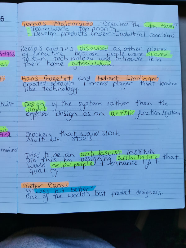
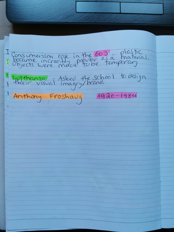
Aicher’s type of design was corporate branding, and he was considered one of the leaders of corporate design. For example, he helped influence the corporate identity of the company Braun, and also designed the logo for the German airline Lufthansa.
Aicher’s most notable design work was for the 1972 Summer Olympics in Munich, where he was the Game’s lead designer. His role was to create a design that complemented the architecture of the newly built stadium, and he consulted with the designer of the previous 1964 Tokyo Olympic Games, Masaru Katsumie.
For the games, Aicher designed pictograms meant to provide a visual explanation of the sport they featured so that both athletes and visitors could find their way around the stadium and Olympic Village. His pictograms utilised a series of grid systems and a bright colour palette that he chose to represent and reflect the tones of the Alps. These designs influenced the Department of Transportation pictograms, developed by the US in 1974, used in public signage, which have now been used all across the globe.
In 1988, Aicher created the rotis font family, named after the domicile Rotis in the city of Leutkirch im Allgäu, where he lived and kept his studio, as well as designing the logo for the University of Konstanz, as well as the one for Munich Airport.
Aicher died in Günzburg on the 1st of September 1991, after he was hit by a vehicle while moving the grass at Rotis, where he lived.
Despite being raised in Nazi Germany, Aicher was strongly opposed to their movement, and was arrested at 15 for refusing to join the Hitler Youth. Although he was drafted into the German Army to fight in WWII, he attempted to leave multiple times, finally deserting in 1945 before going into hiding.
After the end of the war Aicher began studying sculpture at the Academy of Fine Arts in Munich, and opening up his own studio in Ulm in 1947.
In 1953, Aicher, Max Bill, and Aicher’s wide Inge Scholl founded the Ulm School of Design. The school was dedicated to two of Inge’s younger siblings, Hans and Sophie Scholl, who were executed in 1943 for their membership in the White Rose resistance movement against the Nazi party. It was actually at the Scholl’s house where he hid after his desertion from the German military.
The Ulm School of Design became one of Germany’s leading educational centers for design, producing multiple notable designers over its years, until it’s closure in 1968.
Aicher’s type of design was corporate branding, and he was considered one of the leaders of corporate design. For example, he helped influence the corporate identity of the company Braun, and also designed the logo for the German airline Lufthansa.
Aicher’s most notable design work was for the 1972 Summer Olympics in Munich, where he was the Game’s lead designer. His role was to create a design that complemented the architecture of the newly built stadium, and he consulted with the designer of the previous 1964 Tokyo Olympic Games, Masaru Katsumie.
For the games, Aicher designed pictograms meant to provide a visual explanation of the sport they featured so that both athletes and visitors could find their way around the stadium and Olympic Village. His pictograms utilised a series of grid systems and a bright colour palette that he chose to represent and reflect the tones of the Alps. These designs influenced the Department of Transportation pictograms, developed by the US in 1974, used in public signage, which have now been used all across the globe.
In 1988, Aicher created the rotis font family, named after the domicile Rotis in the city of Leutkirch im Allgäu, where he lived and kept his studio, as well as designing the logo for the University of Konstanz, as well as the one for Munich Airport.
Aicher died in Günzburg on the 1st of September 1991, after he was hit by a vehicle while moving the grass at Rotis, where he lived.
Illustration History and Practice session 7 notes
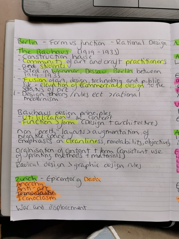
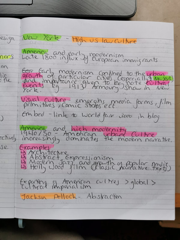
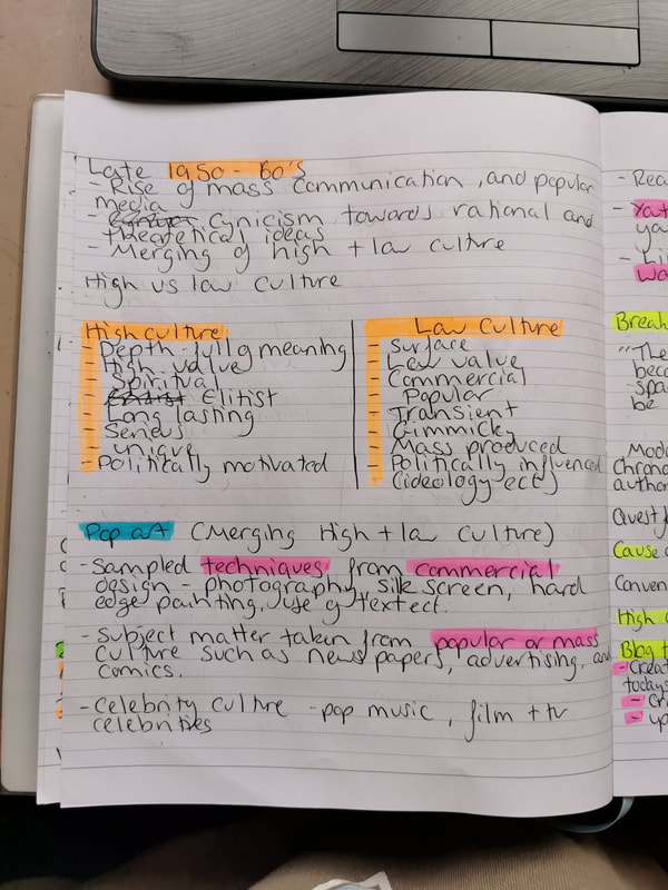
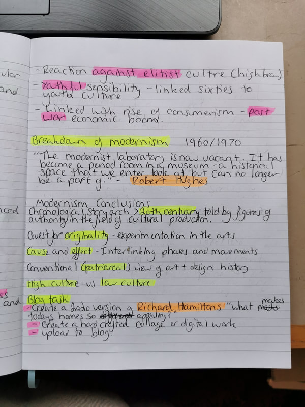
Session 7
Blog Task -
Blog Task -
- Create a 2020 version of Richard Hamilton's "What makes today's homes so different, so appealing?", using hand crafted collage or digital work.
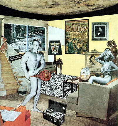
((Info on Richard Hamilton, and his work.
Explain my process, why I chose the images, why I chose the medium ect.
Include process images of my work))
Illustration History and practice session 8 notes
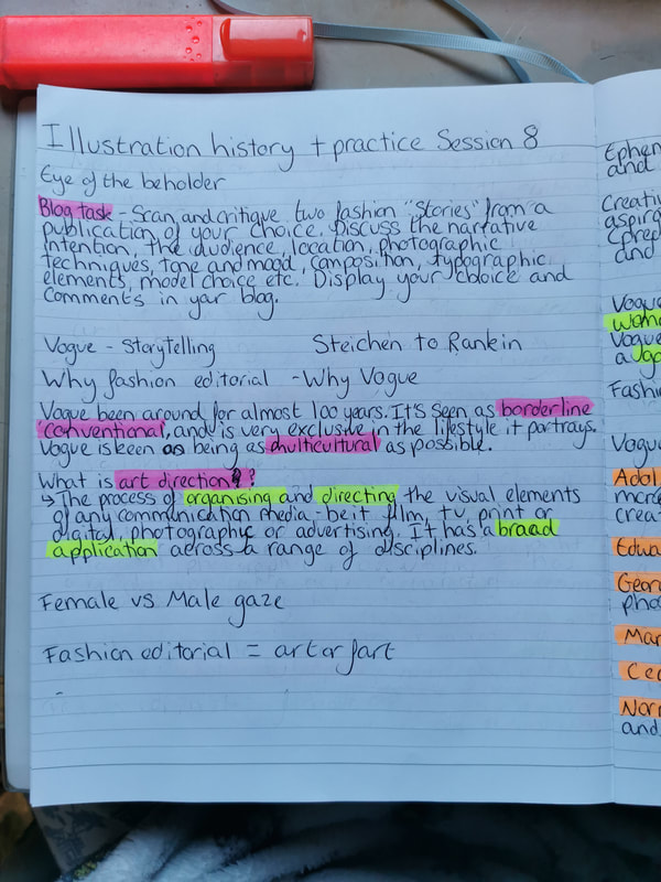
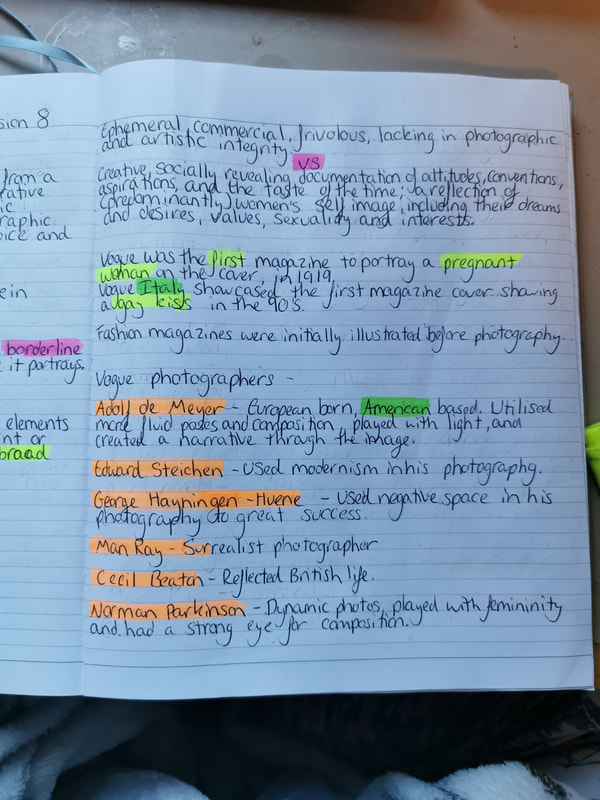
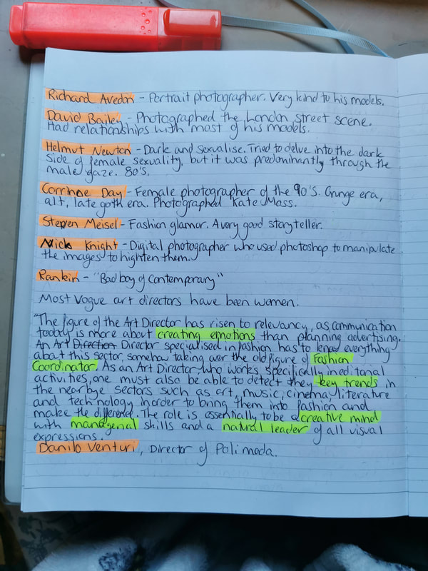
Illustration History and Practice session 9 notes
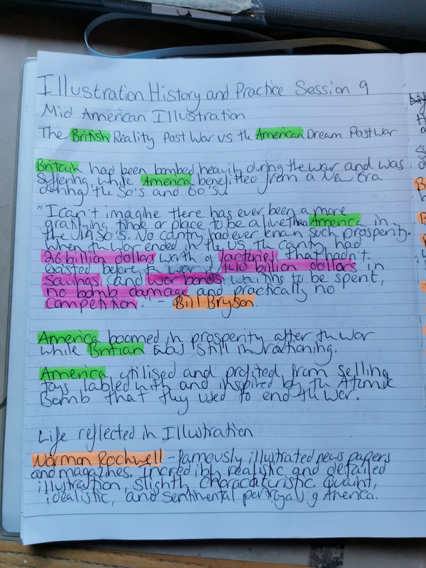
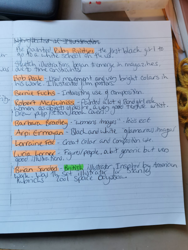
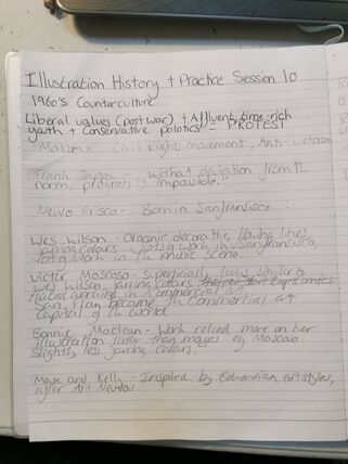
Illustration History and Practice session 10 notes
|
|
Session 10
Blog task -
Blog task -
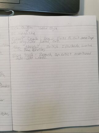
- Research an artist mentioned and write 300-400 words on their life
Illustration History and Practice session 11 notes
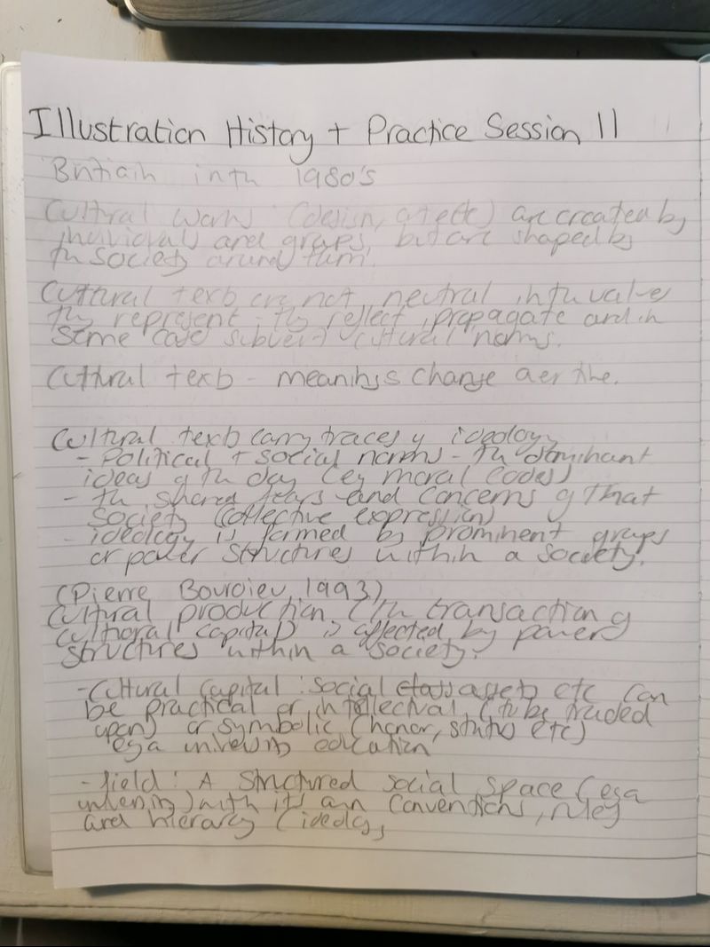
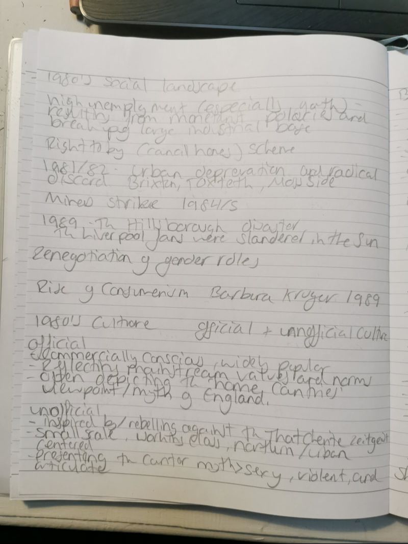
|
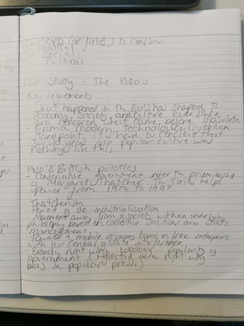
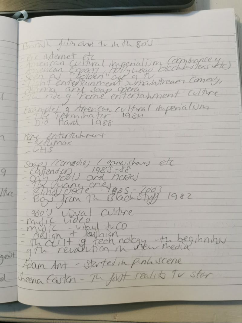
|
|
|
Session 11
Blog task -
Blog task -
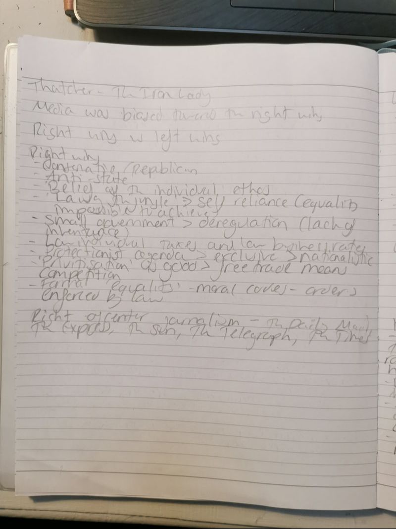
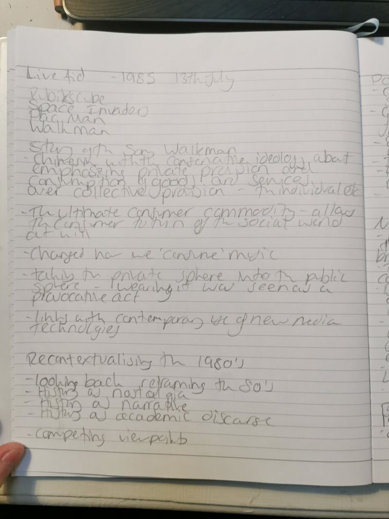
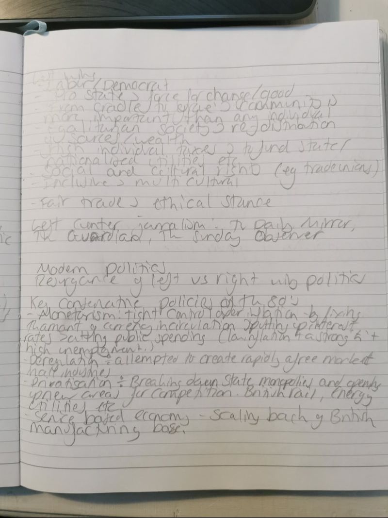
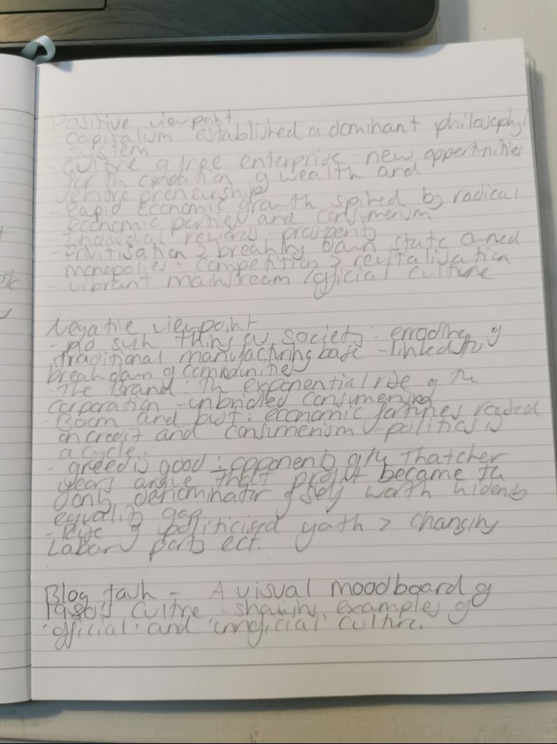
- Create a visual mood board of 1980's culture, showing examples of 'official' and 'unofficial' culture