Colour Wheels and Pallets
Brief - Create a 200 mm diameter colour wheel using only yellow, blue and red paint, then create a sixteen step grey scale and a sixteen step tonal scale on the same page. Then create a palette using colours you find visually appealing before producing an arrangement of six coloured squares that communicate the following words;
Autumn Misty Morning Hospital Ward
Abstract Work
My favourite of the six pieces is Aggression, because I feel like it is the one collage that instantly portrays the emotion it is meant to represent. The sharpness of the spikes along with the simplicity of the piece easily portrays the reality of aggression as being a single minded, unrelenting emotion. The combination of the red and yellow can easily be interpreted as the physical representation of anger, and jealousy, all components that make up aggression as a whole.
However, my least favourite piece is Tokyo. I tried to emulate the neon lights of the night life that Tokyo is famous for, but I feel like I didn't accurately represent the feel of the city at all. The lines are rough and uneven, and I didn't manage to get the colours as bright as I'd hoped they'd be. If I attempted to do this again, id possibly try to emulate the Tokyo skyline instead of the nightlife.
Book covers
Brief - You should produce three paperback front covers, one in the style of each designer. The title of the book is The Tree, and that should be included in each final piece. Each book should be a different genre; one should be a children's book; one a science fiction title, and the third should be a work of phycological horror. You decide which illustrator's style to use for each genre of fiction. The central image of each illustration should be a tree. The final size of the book jacket is 130mm wide x 195mm high, however the only illustration rendered at that size should be the pencil crayon image. Due to the nature of the media, the other two should be executed 50%-100% larger than they will be finally reproduced.
Brad Holland
Brad Holland was born in Fremont, Ohio, USA, in 1943, and his work has appeared in many national and international publications such as Time, Vanity Fair, The New Yorker, Playboy, Rolling Stone, The New York Times, and many more.
As a teenager, he sent many drawings to Disney and to the Saturday Evening Post, but was rejected from both. At the age of 20 he was hired by Hallmark to illustrate books as a staff artist, one of which was A Christmas Carol by Charles Dickens. In 1967 at the age of 23, Holland moved to New York to pursue a career as a full time freelance illustrator.
Two significant milestones in Holland’s early career was becoming a regular contributor to Playboy in 1967 and The New York Times in 1970. His contributions to the Times were seen as a shift in how illustration could be used in print, and by 1986, he was considered “the undisputed star of American Illustration”.
He credits inspiration for his ink drawings came from German artist Heinrich Kley and his black and white works were inspired by Austrian artist Alfred Kubin. Holland also credited Mexican Muralism of the 1920's as being significant in his inspirations too.
|
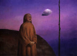
I chose to illustrate the Sci Fi book in the style of Brad Holland, as I feel like his use of acrylic, his drybrush technique, and command of colour all accumulate into a style very reminiscent of old fashioned Sci Fi novels. The bright colours of his artwork are visually striking, and the scrubbing technique he utilises in his work evoke the feeling of clouds and nebulae, a very alien aesthetic that was easily pairable with the genre presented.
For these thumbnails, I played with colour palettes from his own paintings, experimenting with what would evoke the most futuristic and alien aesthetic with the initial concept. Initially, I wanted the piece to have a warm palette, with the planet and the foliage of the tree to be in shades of orange and yellows, but the more I experimented the more I found that the colder palettes worked best with the theme. |
I found this painting of Holland's, and tried to replicate the colour and gradient of the sky onto the background of my own piece, as I felt like it evoked a feeling of deep space and gas clouds that I wanted to include in my illustration.
|
|
I wanted to emulate the feeling and look of a gas giant in the planet, so when I stumbled across this painting Holland's, I knew that I had to use the same sweeping lines and curling tendrils to give my illustration an organic but still alien look, to emphasise that the planet is not one that we know. The colour pallet of this painting inspired me as well, as the deep blues and turquoises contrasted well with and brought out the warm purple tones of the rocks in the foreground, which was an effect I wanted to utilise in my own piece. |
Anne Yvonne Gilbert
Anne Yvonne Gilbert is a British illustrator born in Northumberland, England in 1950. She studied graphic design for a brief time at an art college in Liverpool before managing to get a job at the Sunday Telegraph, “stumbling” upon her career as a professional artist. She has worked for Playboy and Men Only, and her cover design for Frankie Goes to Hollywood’s 1983 single “Relax” has been described as one of the most famous record sleeves of all time. Now most of her career focuses on illustrating a wide range of popular books, but she has also designed a series of stamps for the royal mail depicting Christmas themes and Arthurian mythology.
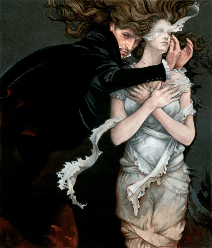
Gilbert’s art has been called fantastically elaborate, as she draws most of her art with coloured pencils, achieving an amazing amount of detail despite her calling them an “unreliable medium”. Her work varies from the delicate and fay illustrations of her fairytale artwork, to drawings published in Playboy, depicting “rubber outfits” and leather, making her work a stark contrast to itself.
Gilbert’s art has been called fantastically elaborate, as she draws most of her art with coloured pencils, achieving an amazing amount of detail despite her calling them an “unreliable medium”. Her work varies from the delicate and fay illustrations of her fairytale artwork, to drawings published in Playboy, depicting “rubber outfits” and leather, making her work a stark contrast to itself.
Charles Keeping
Charles Keeping was an English illustrator, born in London, on the 22nd of September 1924, who died on the 16th of May 1988 of a brain tumour.
Keeping left school at the age of 14, and after he took a correspondence course in art. He took a job with the book printing company William Clowes and Sons, and produced munitions for the engineering company, Durrants, during WW2. When he turned 18 in 1942, he joined the Royal Navy and served as a wireless operator for 4 years. He applied for a grant to study art at the Regent Street Polytechnic, but was initially turned down, until he got his grant and studied full time from 1949-1952, specialising in illustration and lithography.
He was commissioned to illustrate Rosemary Sutcliff’s historical children's novels, which lead to establishing a new, exuberant style of children's historical fiction which refused to shy away from the violence of warfare.
Keeping’s full colour illustrations are messy and spontaneous. He used intense colour, sponge texturing and wax resist.
In the 1980’s, Keeping created four picture books in black and white, aimed towards older children. He illustrated The Highwayman in gruesome detail, which won him his second Greenaway Medal; Beowulf, in which the illustrations of the monster, Grendel, were visually sympathetic towards him; The Wedding Ghost, and The Lady Shallot, all of which were illustrated in an evocative line and wash.
Keeping also illustrated the complete works of Charles Dickens for the Folio Society, and was a runner up for the Hans Christian Andersen Award in 1974.
Song comic
Brief - Create an eight-page ISSUU book comprising of two double sided sheets bound together. This book is a personal response to the lyrics of one of the following songs -
Wichita Lineman
Ring of Fire
The Moon is a Harsh Mistress
Light Up My Room
The Luckiest Guy on the Lower East Side
Shipbuilding
The comic is not a promotional piece for the artist and you have complete freedom when it comes to size, format and technique. The full text of the lyrics should appear in the book, and the book should have a front and back cover (pages 1 & 8) with the title and author displayed on the front.
Song chosen - Luckiest Guy on the Lower East Side
After listening to all of the songs on the list, I decided that my favourite two were Luckiest Guy on the Lower East Side and Light up My Room. To me they were the ones with the most narrative potential and I immediately wrote down any ideas I had for them. For light up my room I had the idea of a story about a suburban town where something supernatural or mysterious is occurring, but I realised that might have been too hard to portray in an 8 page comic.
For Luckiest Guy, I had realised that the song never outright mentioned a car, and I though I could out my own spin on it by having it be about roller-skating instead, and I could immediately picture thumbnails for the comic, so I chose to do this one instead.
|
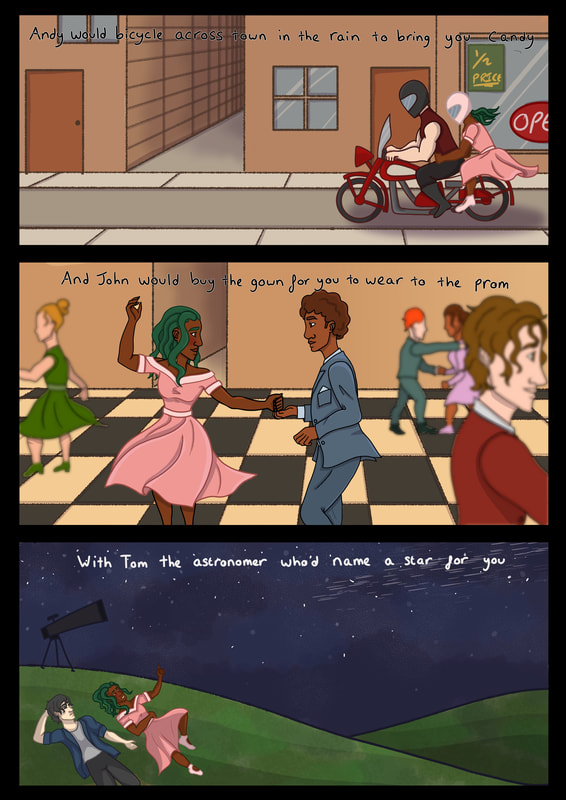
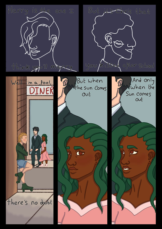
As the song is about the singer being in love with a girl who spends a lot of time with other men, I played with the idea of instead of going along with the heteronormative narrative it presented, that I could change it up slightly by having the singer be a woman. Many lesbian and bisexual women in the past had to often hide the nature of their relationships, and many often had to date men as a cover, due to a heteronormative and anti-LGBT society in order to remain safe and undiscovered.
Knowing that piece of history gives this song a new layer of context, and implies that this is they type of relationship that the woman singing and the woman being sung about were in. This gave me a time period to set the comic in, around the 50's-60's, and gave me an aesthetic for the main two characters. The woman being sung about is the typical femme-fetale, a very beautiful and popular woman, while the person singing the song is the opposite, a greaser and an outsider. |
After coming up with the aesthetics of the main character, I wrote down the lyrics of the song and came up with thumbnails for each line. This presented me with the narrative of the singer reminiscing on her partner as she gets ready to meet her for a date, so I sketched out thumbnails to showcase this story before refining it into a more concise comic.


