Wordless recipe
Brief -
To communicate a recipe on a single sheet without words.
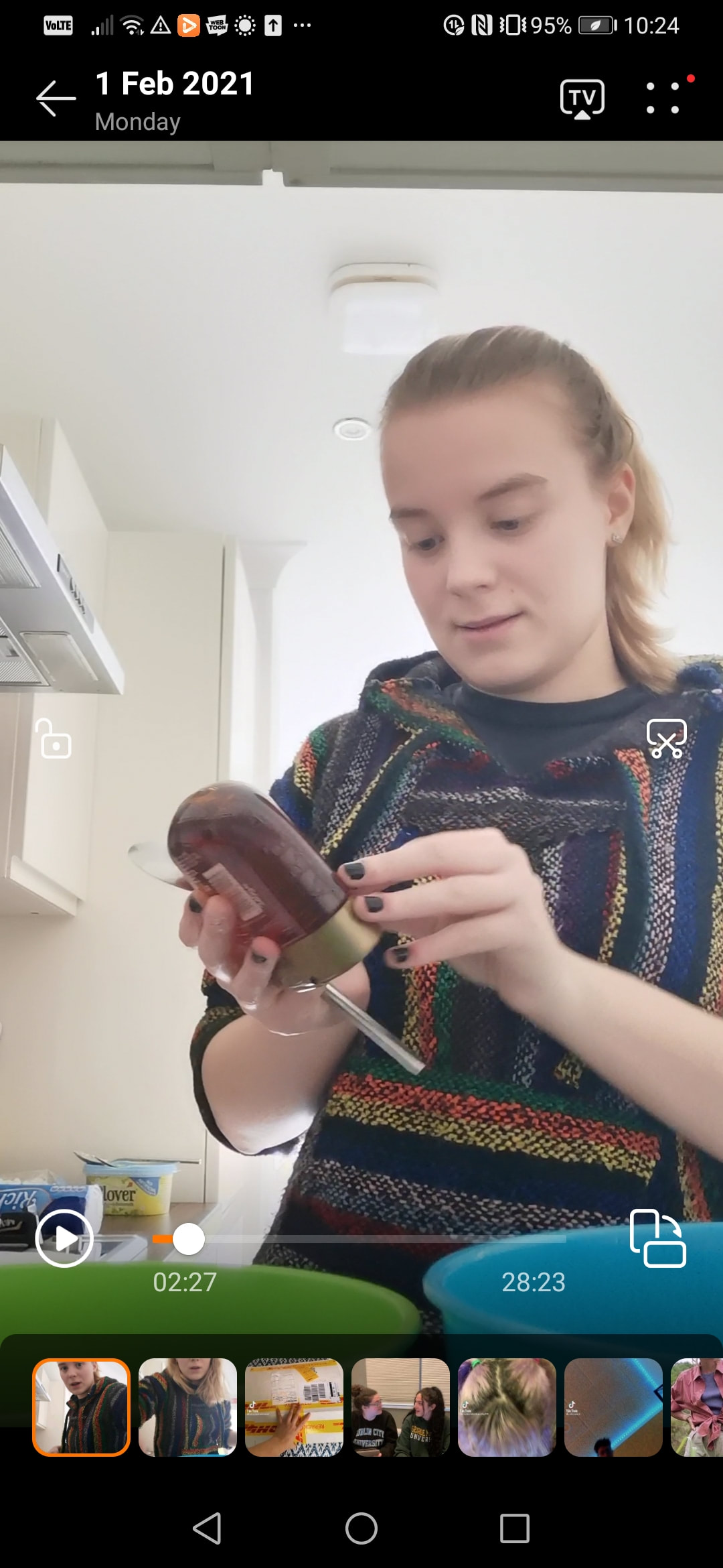
Stage 1: Research - Choose one of the recipe options ( I chose rocky road ), and bake it. Make sure to record exactly what you do, use multiple methods to do so eg photography, video etc. You want as much primary source material to work with as possible from this stage.

|
|
|
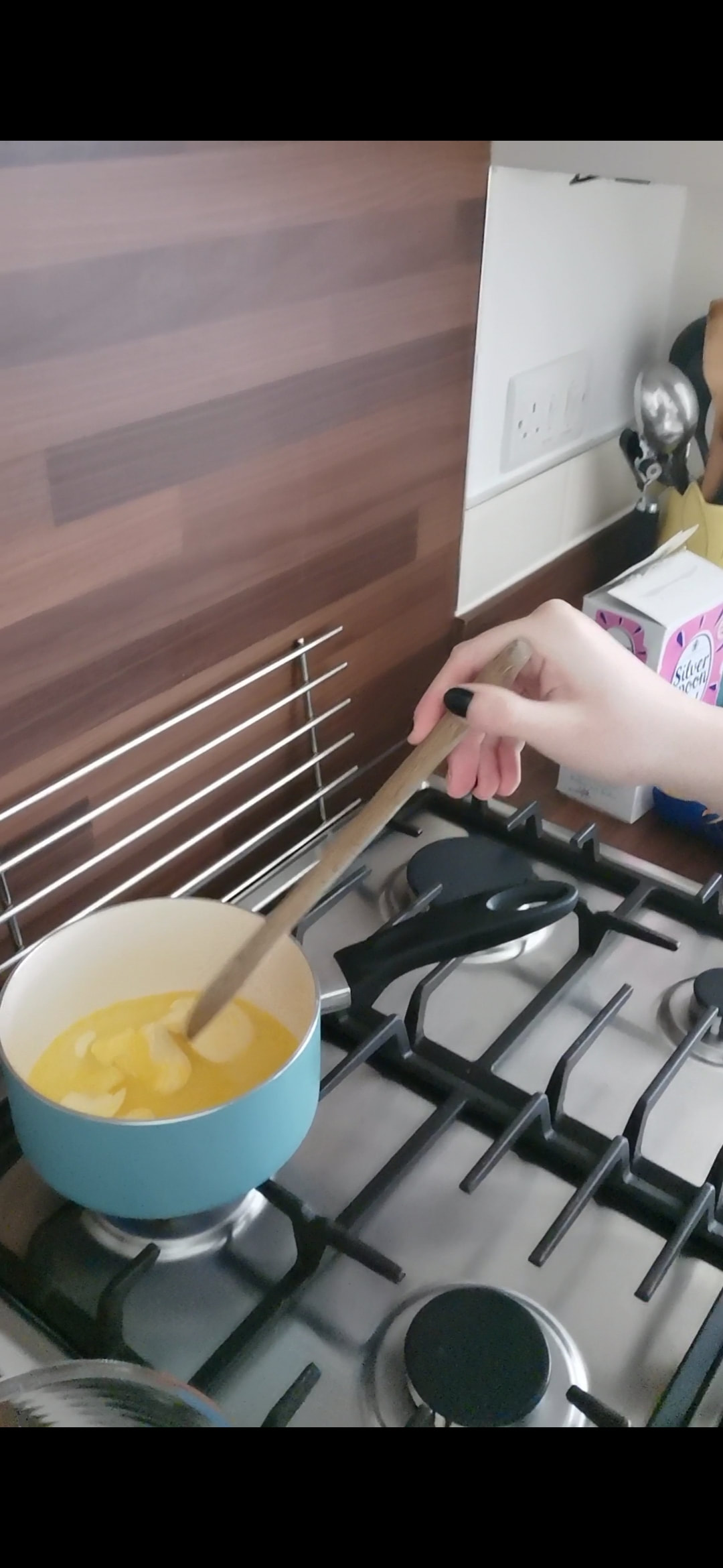
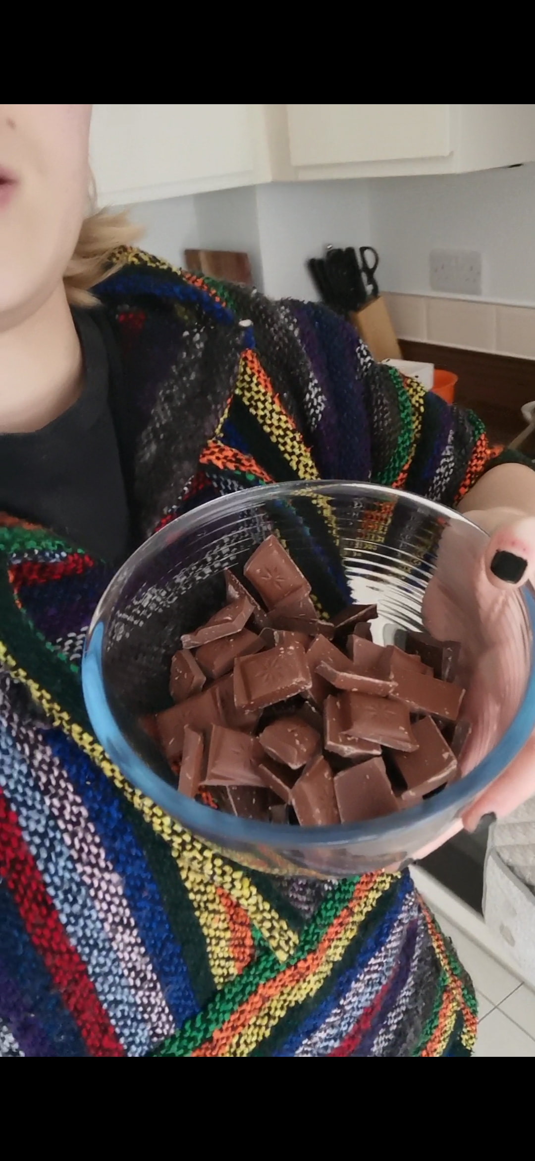
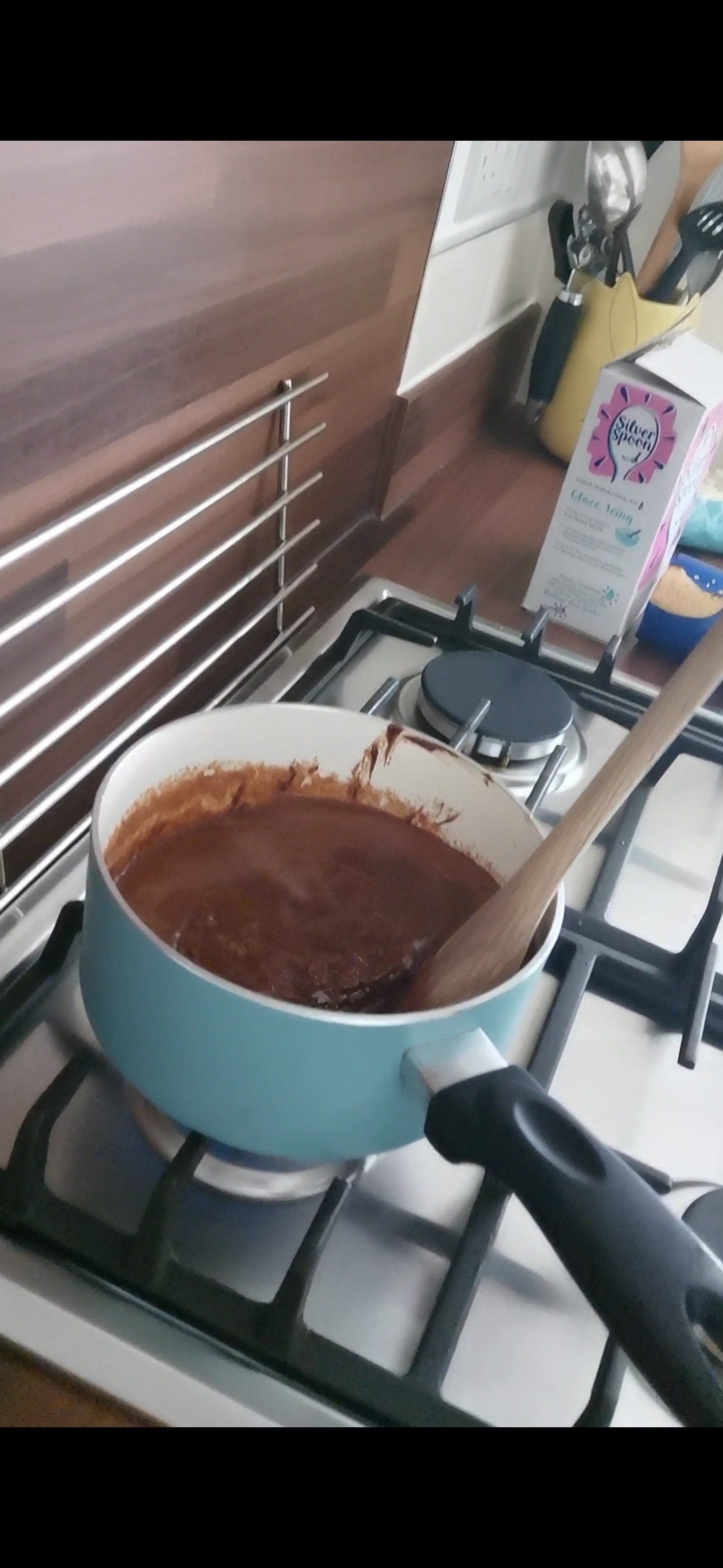
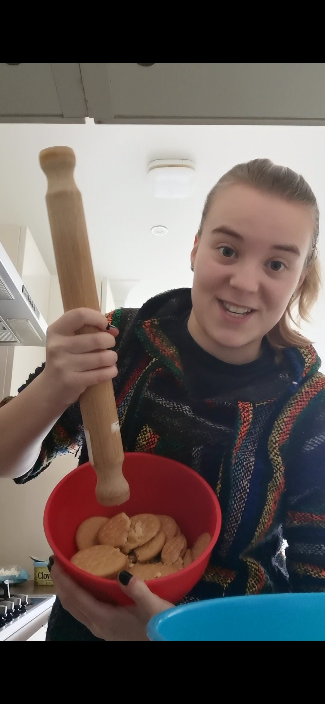
Ingredients - - 1 cup of soft butter - 300g of chocolate - 3tbs of gold syrup - 1 cup of crushed tea biscuits - 1/2 cup of mini marshmallows Method - 1 - Heat butter, chocolate, and syrup into a pan over a gentle heat. When the mixture is melted, remove it from the heat. 2 - Scoop out 1 cup of the mixture and set it to the side. 3 - Crush the tea biscuits until it consists of large crumbs. 4 - Fold the biscuits into the chocolate mix and fold in the marshmallows. 5 - Pour the mixture into a square tin and smooth the top with a spatula. 6 - Pour the remaining chocolate mixture over the rocky road. 7 - Refrigerate for 2 hours. 8 - Serve and enjoy! |

|
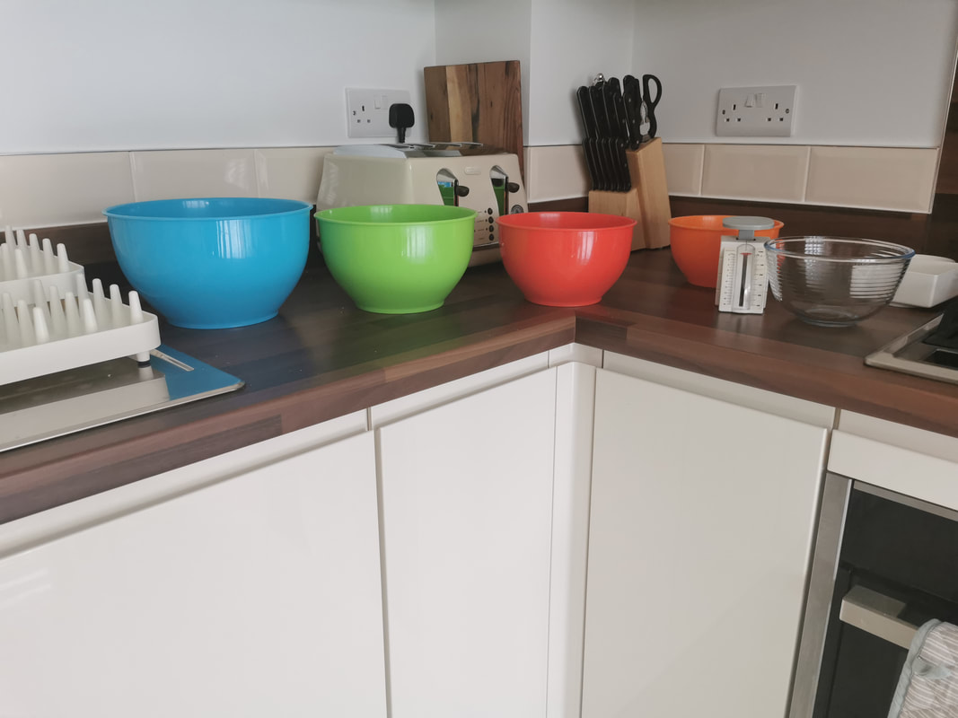
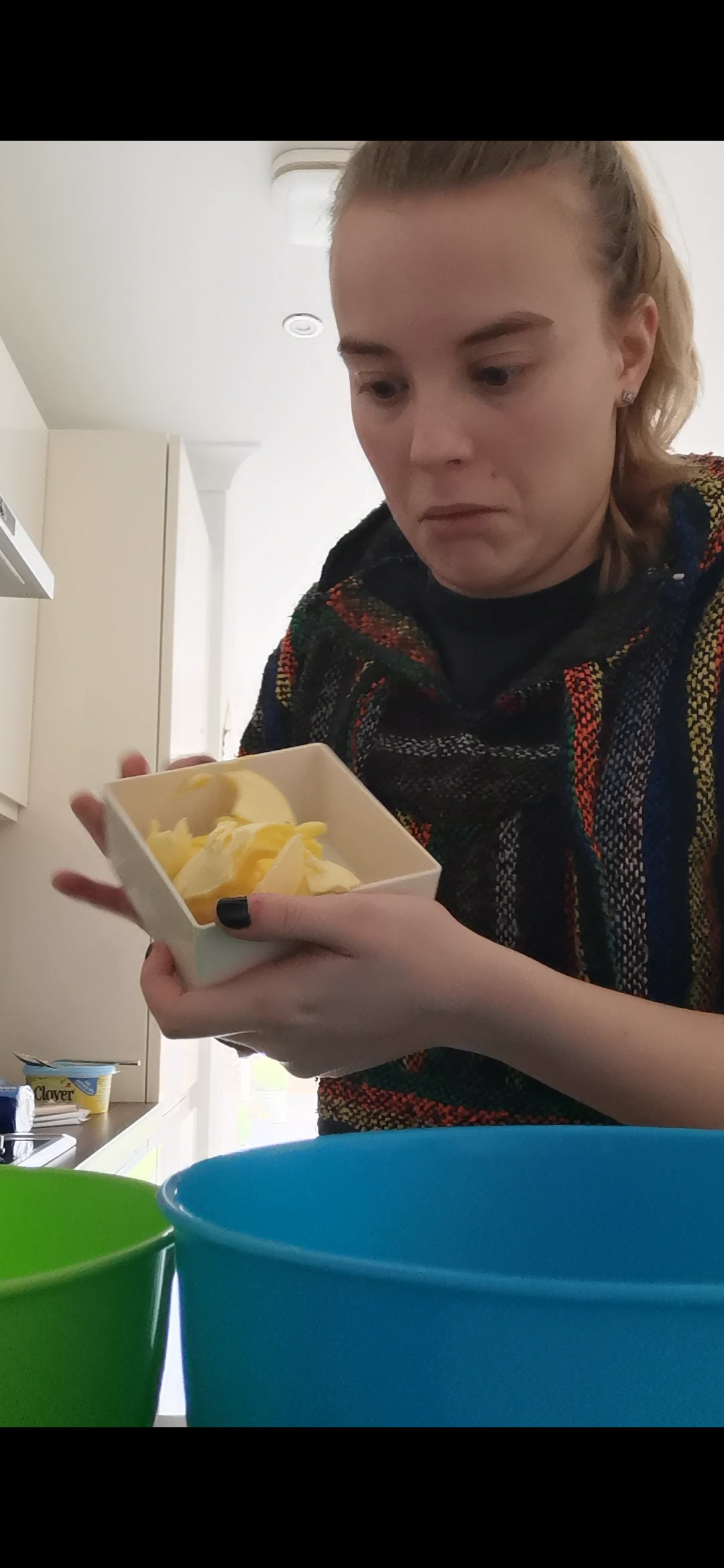
Process images -


Stage 2: Test - Consume your creation.

|
The rocky road was tasty, but not the best. It was difficult to get out of the pan without it all breaking, and the marshmallows all drifted to one side, while the poured chocolate headed to the other. It would have been better if I had melted the marshmallows first and then poured them in, because it is quite crumbly, and it would have helped bind the ingredients together more. If I was to make this again I would use less marshmallows, crush up the biscuits more, and include slightly more chocolate so everything can bind together better. |
Stage 3: Exploration - Explore alternative strategies and visual treatments that show how to follow the recipe. We're looking for a wide range of initial considerations here so be creative in your image-making - drawing, painting, collage, diagrams, digital or analogue, etc. Remember that you're experimenting with techniques at this stage, you should be opening up new lines of visual enquiry, not just sticking to what you already know.
Also, explore the different formats. Does the format dictate, influence or change how you arrange the components of your recipe?
At the end of the project you will be expected to have the following:
- Blog post/s of your references, research, ideas and approaches to the brief, forming an annotated record of your ideas, exploration and development process.
- A hi-resolution JPEG of your final solution
- Your final solution professionally presented on your website
Initial ideas -

|

|
Developing ideas -
|
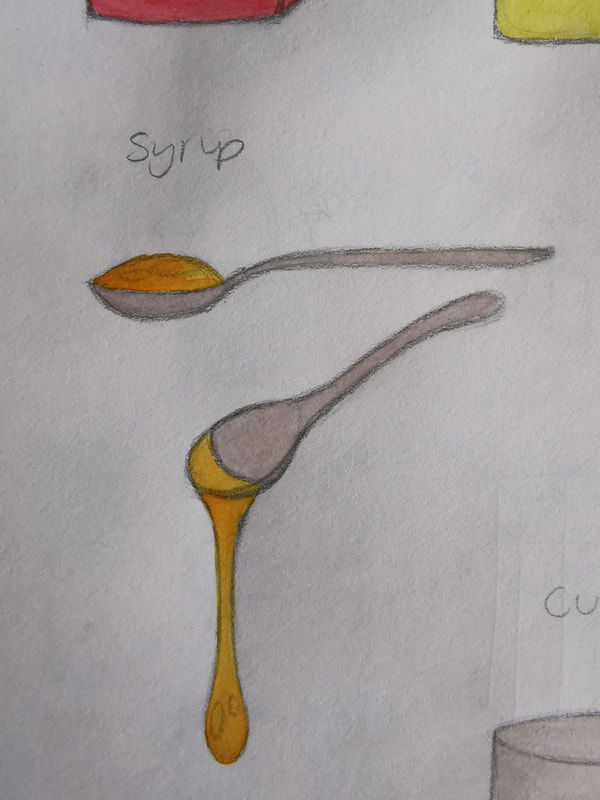
Idea 1 - My first initial idea was to take it in a cartoonish style. Since baking is a family activity, a lot of kids get involved, as its both fun and tasty. Because of this, I thought that aiming the style illustrations towards children might make it more appealing. I sketched out ideas of how I would portray the ingredients, as I had the idea to give them arms and legs, to personify them and potentially bring in a comedic element to the piece. Then I sketched out a rough idea of how the recipe would potentially be illustrated, trying to showcase and include accurate measurements to make it as realistic and as easy to follow as possible. |

|
|
Idea 2 - This idea was meant to focus more on the person baking the rocky road, and showcase their part in the recipe. I was going to showcase the person baking, in almost a step by step method, instead of a singular illustration, and have the layout in a 3:1 ratio. It was meant to be in a rustic style, akin to many other illustrated recipes, using watercolours and a stylised figure rather than anything incredibly realistic. |

|
|
Idea 3 - This illustration was going to be viewed from above, allowing the viewer to be able to see the process and baking ingredients more clearly. This meat that the piece would have more movement to it than if it was just the ingredients in the bowl, as the hands would grant some agency and motion to the piece. I thought that the 2:1 landscape layout would be most appropriate for this idea, as it allows the piece to be viewed in a very easy manner, as we read from left to right, and the landscape format means that the piece would flow well together. |

|
|
Idea 4 - This idea was mean to be more illustrative than the rest, as I thought that I would turn the recipe and baking process into a comic, which would allow me to be more narrative with this piece then any of the others. Since there are 7-8 steps in the baking method, I thought that I could use 7-8 comic panels to portray this recipe, using them to showcase the baking process in a linear flow. To give it more of a personal feel, I thought that I could include a parent baking with their child, to show that baking is a family experience, and to help widen the audience bracket to children as well as adults. |

|
|
Idea 5 -
|

|
|
Idea 6 -
|

|
|
Idea 7 -
|

|
3 Favourites
1 - Cartoon food making cake - watercolour/digital illustration.
Style inspiration : Adam Larkum, Joren Cull, Lukas Bischoff
2 - Woman cooking - Show method. Watercolour/guashe illustration. Styalised.
Style inspiration : Anne Davidson, Rebecca Gibson, Iratxe Lopez de Murain
3 - Floating food - Simple illustrations of food. Watercolour/digital.
Style inspiration : Kavel Rafferty, Camilla Grey
3 developed ideas -
- Things to include in development sheets -
- Do medium testing - write pros/cons of each
- Design elements from artists - copy/practice elements of their art to help inspire my work
- Play with layout
- Sketch ingredient/equipment
- Do medium testing - write pros/cons of each
- Design elements from artists - copy/practice elements of their art to help inspire my work
- Play with layout
- Sketch ingredient/equipment
|
Develop page 1 - WIP Adam Larkun Lukas Bischoff Rosanna Tasker Develop page 2 - WIP Annie Davidson Iratxe Lopez de Munain Develop page 3 - WIP - chose this idea Kavel Rafferty Camilla Gray Alex Cabal |


|
Ingredients
I started visually developing my work by sketching out the initial idea I had for the illustration, and developing it more. Then I experimented with the style of my illustrations, trying to work out how I should draw the ingredients and different components of my work, before finalising them into a simple, and concise style that would easily be recognised.


Thumbnails
|
From there, I then experimented with the layout of my recipe and then chose my three favourite layouts to continue developing. I chose these three ideas, because I feel like I could use these layouts to accurately portray the illustrated recipe in a concise and legible manner. However, I do need to sketch some development thumbnails and experiment with mediums to choose which will be my final choice. |

|

|
For the 3:1 portrait layout, I decided on the idea of having each step flowing down from each other across the page, eventually reaching the final illustration of the finished rocky road at the bottom of the page. To do this, I decided on having the panels in contact with the one above and below it, so that the viewers eye can easily be drawn from one panel to the next in a legible manner, and not get too distracted by any other aspect of the piece. |
I then decided to change my idea to my first initial idea, as I felt it could showcase my diversity as an illustrator, and I liked the idea more.
|
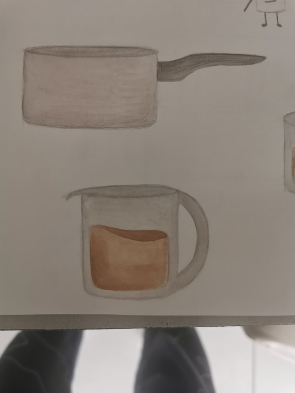
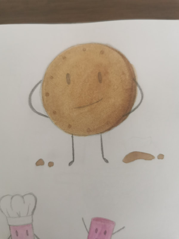
I started the same way I began the other idea, with a few more refined thumbnail sketches of the panels of the comic to flesh out my idea more. I experimented with the handles of the pots for a while, to try and help differentiate between the pot and the measuring cup, but then realised having one longer handle made it easier for the pot to be recognised. I then decided on the actual design of the pot, it would be a different colour and have a different handle shape than the measuring cup. I tried to keep the marshmallows continuously throughout the illustration so that they help tie it all together, and bring a comedic element to the piece as a whole. |

|
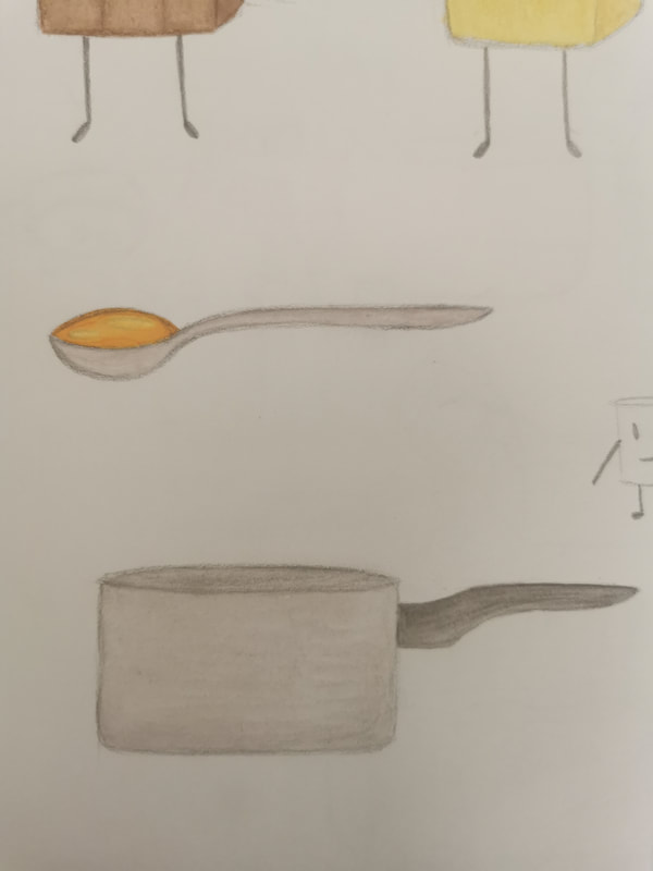
I then moved onto sketching and designing the ingredients and equipment that would be shown in the illustration. I decided to keep to simple colours with little to no shading, as I wanted this illustration to be more geared towards children as the target audience, with simple and legible designs that can easily be followed, with cartoonish aspects such as the arms and legs to bring more interest to the piece.


|
After that, I then experimented with the layout of the piece, using the same 3 designs from before. After experimenting with the 3:1 portrait layout previously, I decided to try the 2:1 landscape layout instead to see how that would fit the illustration better. Since there are 8 steps to the recipe, there were 8 panels, which fit concisely into this format quite well. I tried out watercolour as my medium, and I really liked the simple and rustic feel it brought to the piece, so I decided to continue with this through to the final piece. However, the brown of this watercolour pallet was too red for my liking, so on the main illustration I decided to use another, cooler brown to help desaturate the piece. |
Finished piece
